Super Flower X-Mask: Mild-Mannered or Superhero?
by Purav Sanghani on May 20, 2004 12:05 PM EST- Posted in
- Cases/Cooling/PSUs
External Design
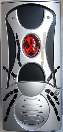
The X-Mask comes in 3 flavors: blue, black, and silver, like the one in this review. The front panel is comparable to the NZXT Guardian with a slight variability in design.The top 2/3 of the front bezel consists of the door, which is light and simple. A Spiderman-like mask decoration is placed at the center, which lights up when the system is turned on. Below this "mask", we noticed that there was a printed design consisting of 8 spider legs. Many enthusiasts prefer to have a cleaner, more mature look when it comes to their PC cases; some may even think the spider theme to be a bit too cheesy for their taste.
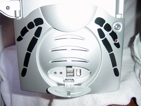
There is a front panel key lock for security on the right side below the door to prevent unwanted access to the case's drive bays. This feature seems redundant, since there are no security features to prevent access to the case's internals. Directly under the key lock on the 3rd printed spider leg is the LED for HDD activity. We thought that possibly combining the Power light (mask) and the HDD light into the mask would have made for a more interesting look.
At the bottom of the X-Mask, or what looks to be the abdomen of the spider, are the auxiliary connections, which consist of Audio (headphone, microphone), 2 USB, and 1 Firewire ports. They are hidden behind a small oval-shaped, fold-down panel. The Audio ports are also color-coded as on many other cases to make it easier to differentiate between the two.
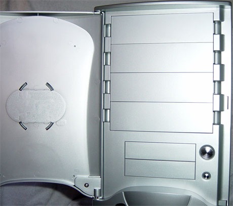
Upon opening the door, we see the drive bays and Power and Reset buttons. There are 6 drive bays in total, consisting of four 5-1/4" drive bays and two 3-1/2" drive bays. The Power and Reset buttons are to the right of the 3-1/2" drive bays.
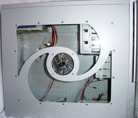
The left side panel has a window and also a fan mounting. The grill on the fan mounting is machined to look like a spider web and has a black spider painted on it to carry on the spider theme. Both side panels are easily removable and are held to the case by thumbscrews.


21 Comments
View All Comments
Gromis - Friday, May 21, 2004 - link
Have to agree with #2 here, enough with the crap-ass, ugly, expensive, NOISY cases. Bring some publicity to actually functional offerings - take CompuCase LX-6A19 for example, or one of it's many clones such as Antec SLK3700AMB. I mean, who in their right mind would put a system with 5 80mm case fans in addition to CPU, GPU and PSU fans on their desk? The only case I can think of, is someone completely stone deaf, and therefore unconcerned about the roar all the fans are making.CitizenKain - Friday, May 21, 2004 - link
Yikes, I wouldn't wish that case on my worst enemy. That Raidmax you linked to is almost as bad. Sticking a bunch of plastic on an Antec 1000 series doesn't make a attractive case.jrphoenix - Friday, May 21, 2004 - link
Purav,Good review, very thorough! I wouldn't buy this case (not my favorite design) but, good reveiw none the less.
Keep reviewing the pre-mod cases... the comments from those above make me laugh :) So "affected" because they aren't seeing their desired beige or silver box (and I do mean "box").
If you are taking requests for reviews.... I would like to see another review of an Opus Technologies case: http://www.opustek.com/main/product/case/case_list...
The terminator has a very unique cooling design that I would like to hear more about (the last Opus case looked solid)
or
http://raidmax.com/products/products_display.php?p...
Silver color :) This case was originally designed almost identical to the Alienware case before they were sued (you can still see the shape of the alienware under the moldings). Supposedly directron is going to be selling the case for $150+ (I want to know why so much, what's so special).
Good job!
araczynski - Friday, May 21, 2004 - link
I agree that its not something for me either, but I think only becuase the spider design looks too 'analog', i think if it was a big rougher around the edges, perhaps more mechanized in appearance, little meaner, perhaps even tribal, in general the look most modders seem to strive for today, then it would have looked more appealing, but as it stands it seems more childish then anything, but hey, if you're a spiderman fan, i'm sure you're drooling, so who knows.Phiro - Friday, May 21, 2004 - link
OK, even I agree it's not that great.The "placement" of the HD led irritates me - it indicates some jackass marketing flack took a normal case and said "hey let's put a spider-esque print on the front, snap in a custom light and call it a spiderman case!
Novaoblivion - Friday, May 21, 2004 - link
All I can say is that is the uglyest case ever.nastyemu25 - Friday, May 21, 2004 - link
heinousif someone i knew had this case i'd push them over and stomp on their throat
Gunbuster - Friday, May 21, 2004 - link
The "mask" looks more like Strongbad than Spider ManPollock - Friday, May 21, 2004 - link
Who would honestly base a case on Spiderman?Operandi - Friday, May 21, 2004 - link
#1IDK, that guardian thing they reviewed awhile back gives it a run for its money.
Seriously though, enough with the sh!ty cases already. I think I speak on behalf of everyone when I say nobody wants to read reviews on cases like that.