MGE Viper: Another Xtreme Gamer Creation
by Purav Sanghani on December 18, 2004 5:14 PM EST- Posted in
- Cases/Cooling/PSUs
Benchmarking - Thermal
Describing the cooling equipment that comes with a case just doesn't cut it for us. We need to see how it actually performs to see if it is actually as effective as the manufacturer's say that it is. We have hand-picked a full system that we believe is the current system setup for the average user.| PC Mid-Tower Test Bed | |
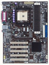
Chaintech VNF3-250 |
 Click to enlarge. |
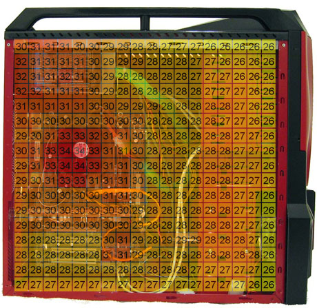
The thermal readings for the key components and points on the motherboard during operation were as follows. The numbers in each square represent the temperature of that particular section of the case in degrees celsius:

Click to enlarge.
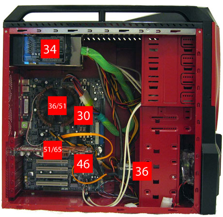
Hold your mouse over to see hardware.
The region under the video card is much cooler than that in Chenbro's Gaming Bomb II that we looked at last week. This is all due to the fan mounted on the left side panel, which takes in air and helps circulate warm air from that region. The current system configuration does not have any exhaust fans, but there are plenty of ventilation areas for air to flow out through the back as well as up through the top of the case.

Click to enlarge.
Hold your mouse over to see hardware.
Temperatures of each key component remains close to the results that we have observed in the past few cases. There are slight variations in temperatures, but very little compared to the variations in ambient air temperatures.


41 Comments
View All Comments
Denial - Saturday, December 18, 2004 - link
Wow, I'm at a loss for words. Who buy such a thing?Nice review :)
radx - Saturday, December 18, 2004 - link
Can't say i love the design of this case. But i do like one thing better with this case than my own Antec Sonata, that be the 120MM fan behind the hard drives. Rather than my case which has the 120mm fan infront of the hard drives.Other than that another cool review done by the guys at anandtech :)
Gatak - Saturday, December 18, 2004 - link
A few of them:http://www.mini-itx.com/projects/decobox/images/de...
http://www.mini-itx.com/news/images/story0363b.jpg
http://www.mini-itx.com/news/computex2004-4/images...
http://www.mini-itx.com/news/images/story0353.jpg
http://www.mini-itx.com/projects/gramaphone-itx-hd...
http://www.mini-itx.com/news/computex2004-4/images...
http://www.mini-itx.com/news/images/story0330.jpg
Gatak - Saturday, December 18, 2004 - link
How about looking for quality cases which are more pleasingly designed? Instead of monsters I would like to see something that would fit nicely in a modern home. Look on how expensive home cinema receivers are designed.Look on this page for many really nice cases: http://www.mini-itx.com/
A few of them:
Locut0s - Saturday, December 18, 2004 - link
To make it clear Purav I'm not saying that Anandtech should look at cases on their external merits alone as you suggest many who complain about style are suggesting. In fact I don't think many of us who are complaining about style are saying that at all. Instead we are saying in many instances "What a shame that such a good case is ruined by such ugly looks". Unlike the internals of a computer where I think looks truly don't matter the chassis is really the only physical presence of the computer that you are ever ware of on a day to day basis. As such many of us would prefer not to have our chassis making a statement such as "hay look how cool I am over here Look Look Look...!" That doesn't mean that the internals of a case are not the most important thing, far from it they are the most important aspect of any case. But that doesn't mean that the external design of a case can't almost completely offset all the goodies inside, it definitely can. No matter how good the internals of a case are I am not purchase a bright yellow Pikachu case for example.By the way I happen to really look forward to most of the case reviews here at Anandtech, they are very thorough and informative. It's not the reviews I have a beef with, it's the trend in the industry to this look that I don't like.
Just my 2 cents
GnomeCop - Saturday, December 18, 2004 - link
sickNovaoblivion - Saturday, December 18, 2004 - link
should be- External visuals wont appeal to anyone
lol
Kccdx2 - Saturday, December 18, 2004 - link
Too true #1shoRunner - Saturday, December 18, 2004 - link
yeah whats up with all the cases looking like they were designed by playschool. More funky colored plastic is not better. Its a computer not an action figureLocut0s - Saturday, December 18, 2004 - link
*sigh*The following needs to be in bold in "The Bad" section:
- External visuals may not appeal to some
Or maybe a label on the box "For ages 12 and under"