Mail 2.0
Mail was one of my original favorites of OS X, although the application itself looked extremely simple. It quickly proved to be much more robust and much less of a resource hog than my previous client, Outlook. As one of my favorite applications under OS X, I was curious to play with Mail 2.0 in Tiger, which has had a handful of changes.When starting up Mail for the first time, it will take a few minutes to import all of your old emails into the new version of Mail.
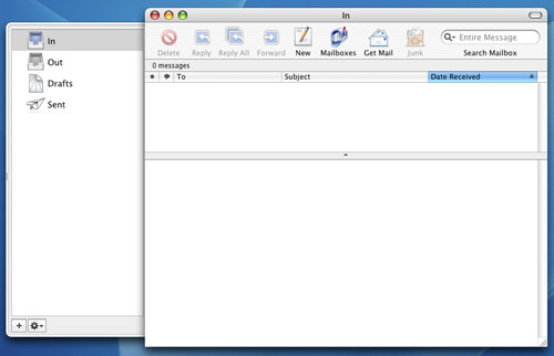
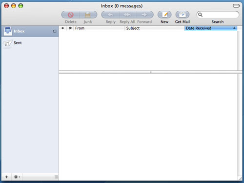
The most noticeable change in Tiger is that Mail has a brand new interface. The new interface is strange - I'm not totally sure what Apple's trying to do with it. It looks good, but it definitely stands out from the rest of the OS. Although the look and feel of Mail has changed, the icons haven't really, which makes them feel somewhat out of place in this new version. I may get used to them over time, but at this point, I'm not. The new top toolbar is quite possibly one of the biggest positive visual improvements to Mail over its predecessor.
Mac OS X Panther Mail
Mac OS X Tiger Mail
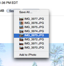
There are smaller interface changes that are nice, such as the new save attachment button. The new button is a lot cleaner/simpler looking now, mostly because it's small. It's a minor change, but I like it.
Mac OS X Panther - Mail Save Attachment button
Mac OS X Tiger - Mail Save Attachment button


The other major changes to Mail are Spotlight related, as all searching in Mail 2.0 is driven by Spotlight. This comes as a huge relief to me as I found Mail's original search to be fast, but lacking in accuracy, not to mention that it was a pain to switch between the fields that I was searching. With Mail 2.0, searching is infinitely more useful. First of all, you no longer have to select where you want to search from a drop-down list. As soon as you start a search, a bar appears that lets you select where to search, and what to search. Unfortunately, searching the "Entire Message" still doesn't catch items that are only in the Subject field and you can't select both, which is a bit of a pain. You can also save your searches as Smart Mailboxes, which are similar to the Smart Folders in the new Finder.
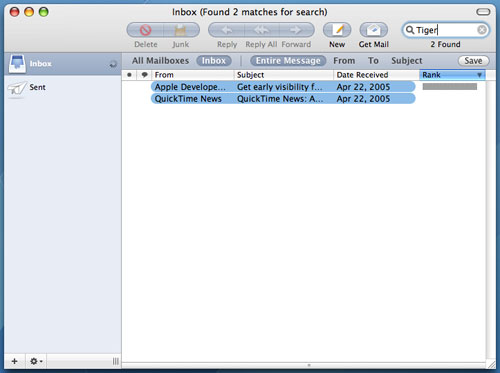
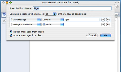
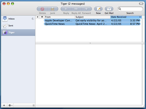
Smart Mailboxes, on the other hand, aren't actually physical Mailboxes - they are just saved searches (much like Smart Folders). So in this case, Smart Mailboxes do still allow the new mail notifier in the Dock to be triggered by manufacturer emails coming in. The downside is that my Inbox doesn't remain as clean and uncluttered. But with a large number of Smart Mailboxes, I could theoretically get things to the point where I'd rarely have to check my main Inbox for email. It's something I still have to play around with more at this point, but the flexibility of Smart Mailboxes is definitely appreciated.
There are other minor functionality tweaks to Mail 2.0, such as a new compose window. When composing emails, you now have the option of adding new fields directly from the compose window, such as a Bcc address field or a Reply-To address field. Also, hitting Command + i in Mail 2.0 now brings up an Account Info pane that will give you a list of all messages on your mail server, as well as let you customize mailbox behaviors. It's a neat panel that can be useful if you have your machine set to leave your POP email account messages on the server for a certain period of time.
Overall, I'd say that Mail 2.0 in Tiger is a reasonable improvement, but mostly because of the features that Spotlight offers. The addition of the slideshow viewing mode is also useful, but the interface tweaks aren't anything to get too excited about in my book. In some cases, I preferred the old, simpler look of Mail, while in others, I welcome the new client. In the end, it still does the same great job that it always did; it's just that now, I can search a lot better and it's easier dealing with pictures in emails.


55 Comments
View All Comments
Brian23 - Saturday, April 30, 2005 - link
Does Tiger Direct carry tiger?JarredWalton - Saturday, April 30, 2005 - link
11 - The Windows XP-64 write-up is in progress, as indicated on page 3. While I can't speak for Anand, the stuff I saw at WinHEC didn't give me any reason to upgrade just yet. Those pesky drivers still seem to have issues, and there are software applications that don't work properly right now. (Benchmarking apps in particular.)Unlike Panther to Tiger, the change from XP to XP-64 is literally just a change of architecture. Unless you're doing high-end computing or running servers and workstations, I think waiting for a few months is probably the best case scenario.
daniel1113 - Friday, April 29, 2005 - link
Check out the PearPC site for speed comparisons. Basically, PearPC runs at about 1/40th the speed of the host processor, so there is no comparison between native Mac hardware and and AMD or Intel equivalent.vailr - Friday, April 29, 2005 - link
Any comments on using Tiger 10.4 with the PearPC? Comparing speed on, for example, an AMD FX55 vs. speed on native Mac hardware?Thanks.
chennhui - Friday, April 29, 2005 - link
Why as a hardware review site doing a software review? May be include a windows 64bits in future? Mac to me is nothing but an expensive system full of eye candy that does run game well. A Powerbook G4 can't even run DOOM3. Lolslashbinslashbash - Friday, April 29, 2005 - link
You forgot to mention that there's a Family Pack of Tiger for $199. It's 5 licenses. Even with only 2 Macs (say, a desktop and a laptop), you're looking at a ~25% discount. Great for those who aren't students. With 3 Macs, you're already doing better than the student discount.Cygni - Friday, April 29, 2005 - link
Good piece, for sure. I think im gonna hold off on Tiger for my 15in Powerbook, even though i can get the student discount. The bugs and such kinda un-nerve me, and i cant really see myself using alot of the new features. Maybe after a few patches, i will move on up.Netopia - Friday, April 29, 2005 - link
Great job and interesting article Anand.You might want to correct the following typo though:
Like it or not, there is a lot that has changed in Tiger but obviously the question is whether or not it is worth the $129 entry [b]free.[/b]
I think you menat FEE.
Glad to see any review from YOU!
Joe
Atropine - Friday, April 29, 2005 - link
Yeah Jbog me too, don't want the wife seeing my porn browsing..........................Jbog - Friday, April 29, 2005 - link
"...Safari has grown old and now complains about those darn kids and their programs that they are downloading these days."Ha ha :)
"Private Browsing" -
If this feature is exclusive to Safari, how come no other browsers have thought of this before, I wonder. As a Firefox user, I find myself cleaning history, cache and other junk every so often.
* In second paragraph of Page 4 - Tiger: The Overprotective Parent?
"... to protect the user from him/her actions -"
should read "his/her"