Mail 2.0
Mail was one of my original favorites of OS X, although the application itself looked extremely simple. It quickly proved to be much more robust and much less of a resource hog than my previous client, Outlook. As one of my favorite applications under OS X, I was curious to play with Mail 2.0 in Tiger, which has had a handful of changes.When starting up Mail for the first time, it will take a few minutes to import all of your old emails into the new version of Mail.
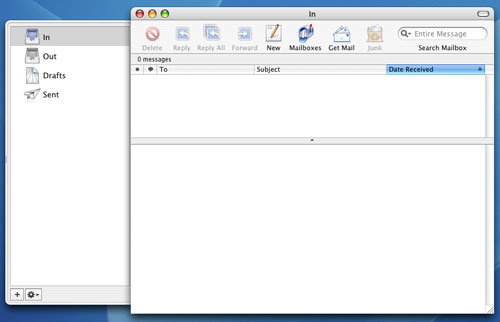
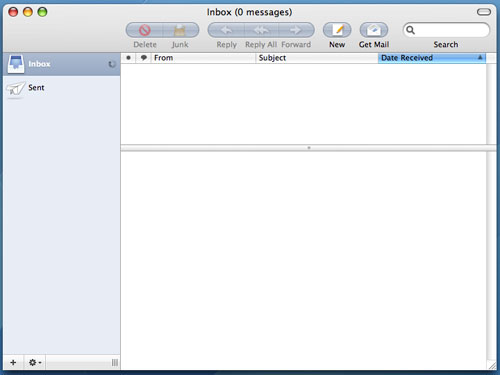
The most noticeable change in Tiger is that Mail has a brand new interface. The new interface is strange - I'm not totally sure what Apple's trying to do with it. It looks good, but it definitely stands out from the rest of the OS. Although the look and feel of Mail has changed, the icons haven't really, which makes them feel somewhat out of place in this new version. I may get used to them over time, but at this point, I'm not. The new top toolbar is quite possibly one of the biggest positive visual improvements to Mail over its predecessor.
Mac OS X Panther Mail
Mac OS X Tiger Mail
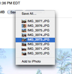
There are smaller interface changes that are nice, such as the new save attachment button. The new button is a lot cleaner/simpler looking now, mostly because it's small. It's a minor change, but I like it.
Mac OS X Panther - Mail Save Attachment button
Mac OS X Tiger - Mail Save Attachment button


The other major changes to Mail are Spotlight related, as all searching in Mail 2.0 is driven by Spotlight. This comes as a huge relief to me as I found Mail's original search to be fast, but lacking in accuracy, not to mention that it was a pain to switch between the fields that I was searching. With Mail 2.0, searching is infinitely more useful. First of all, you no longer have to select where you want to search from a drop-down list. As soon as you start a search, a bar appears that lets you select where to search, and what to search. Unfortunately, searching the "Entire Message" still doesn't catch items that are only in the Subject field and you can't select both, which is a bit of a pain. You can also save your searches as Smart Mailboxes, which are similar to the Smart Folders in the new Finder.
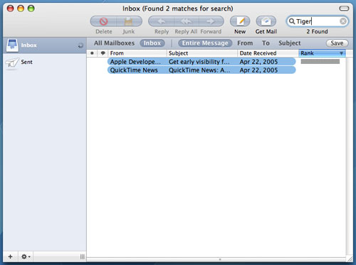
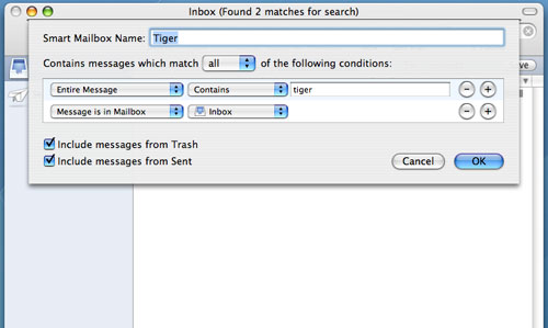
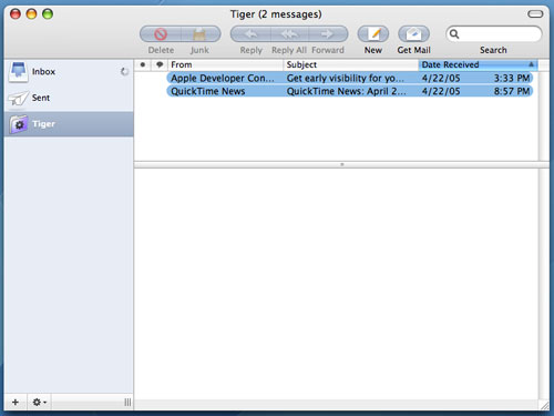
Smart Mailboxes, on the other hand, aren't actually physical Mailboxes - they are just saved searches (much like Smart Folders). So in this case, Smart Mailboxes do still allow the new mail notifier in the Dock to be triggered by manufacturer emails coming in. The downside is that my Inbox doesn't remain as clean and uncluttered. But with a large number of Smart Mailboxes, I could theoretically get things to the point where I'd rarely have to check my main Inbox for email. It's something I still have to play around with more at this point, but the flexibility of Smart Mailboxes is definitely appreciated.
There are other minor functionality tweaks to Mail 2.0, such as a new compose window. When composing emails, you now have the option of adding new fields directly from the compose window, such as a Bcc address field or a Reply-To address field. Also, hitting Command + i in Mail 2.0 now brings up an Account Info pane that will give you a list of all messages on your mail server, as well as let you customize mailbox behaviors. It's a neat panel that can be useful if you have your machine set to leave your POP email account messages on the server for a certain period of time.
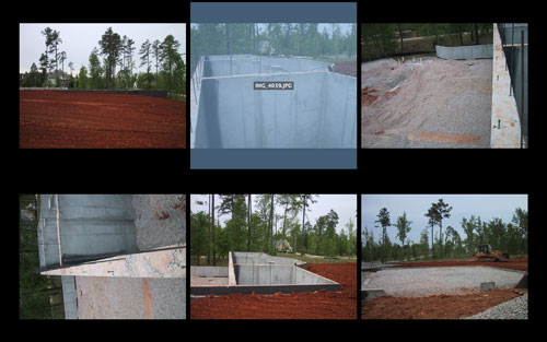
Overall, I'd say that Mail 2.0 in Tiger is a reasonable improvement, but mostly because of the features that Spotlight offers. The addition of the slideshow viewing mode is also useful, but the interface tweaks aren't anything to get too excited about in my book. In some cases, I preferred the old, simpler look of Mail, while in others, I welcome the new client. In the end, it still does the same great job that it always did; it's just that now, I can search a lot better and it's easier dealing with pictures in emails.


55 Comments
View All Comments
elrolio - Friday, April 29, 2005 - link
yayayayayaay, as a dual user myself (my baby the power pc is at home whilst im a gfx designer workin on a powerbook - mine and G5s - company) and im currently installing tiger all over the frikken office. cuz for mac, i AM an early adopter hahahaanyways yay for tiger goddamn its cool
/end fanboystuff
ailleur2 - Friday, April 29, 2005 - link
I should mention that the quartz debug utility will only be accessible if you installed xcode2.And i forgot to mention that the xcode that comes with panther uninstalled itself w/o telling me (or i didnt see it anyway) and i was actually trying to understand why i couldnt compile anything in tiger.
Xcode 2 is free and available on the tiger install dvd.
randomman - Friday, April 29, 2005 - link
Ars Technica managed to enable quartz 2d extreme, its just not on by default (probably for a reason like left over bugs).ailleur2 - Friday, April 29, 2005 - link
Good reviewI find automator to be the potentialy greatest thing since sliced bread.
Heres a site that i would like to see grow so i post it where i can.
http://www.automatorworld.com/
It holds (or will hold, hopefuly) a bank of workload algorithms that you can download and execute.
Spotlight is nice, i actually find myself using it. At first i thought "what, this is the big thing tiger brings?" but its actually quite powerful and useful.
I find safari to be quicker in tiger and the rss support is great althout i have yet to find how to use it as an expandable bookmark like in firefox.
All this was done doing an "archive and upgrade" install of os 10.3.9 on an ibook 800mhz (g3) with only 384mb of ram.
Anand: you can enable quartz 2d extreme (i think) if your graphic card supports it. Do a spotlight search for quartz and run the quartz debug utility and check the menu to enable quartz 2d extreme. Cant test it myself as my ibook only has a mobility 7500.
Shortass - Friday, April 29, 2005 - link
Good article, even though I mostly just scanned through it before I head off to work. I definately wish I had the funds to invest in a nice G5 or a really nice Mac laptop, as I've used them since I was 5 (17 now). If only the hardware pricing was less steep...