Mid-Tower Mega Roundup
by Joshua Buss on September 8, 2005 12:05 AM EST- Posted in
- Cases/Cooling/PSUs
Antec Sonata II
The first of two cases that we'll look at from Antec, a very popular case builder, is the successor to the popular Sonata 1. The Sonata II has changed only slightly on the original in several minor ways, but for the sake of people who are not already familiar with the Sonata, we'll examine the new case in detail.
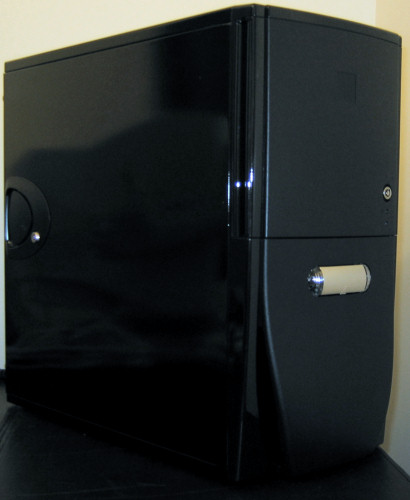
Quite possibly the best looking case that we've looked at here yet, the Sonata II is definitely deserving of a close look for the user who wants a classy machine and not just another box. The high gloss, piano black finish covers the sides and top, while matte black plastic plates make up the front of the chassis.
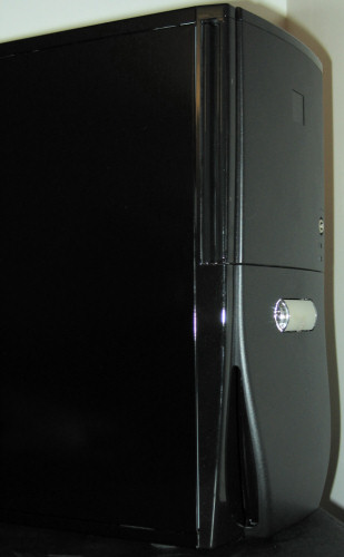
The front has been designed to keep functionality to a maximum while keeping as sleek a look as possible.
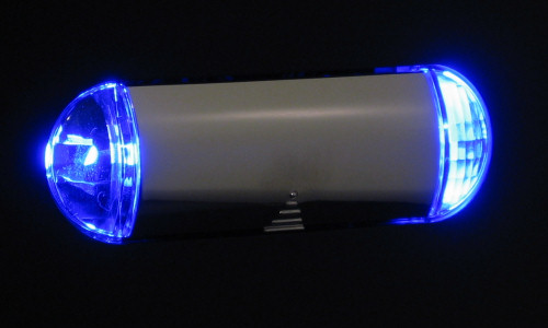
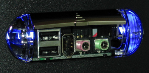
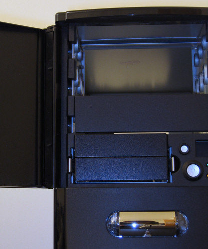
The drives are hidden behind a double-hinged lockable door, and the bottom half is cut in such a way that there are two large vents for air intake without them being very visible from the front. Towards the top of this half is the covered port cluster, which is flanked by two blue prismatic LEDs.
The first of two cases that we'll look at from Antec, a very popular case builder, is the successor to the popular Sonata 1. The Sonata II has changed only slightly on the original in several minor ways, but for the sake of people who are not already familiar with the Sonata, we'll examine the new case in detail.
Quite possibly the best looking case that we've looked at here yet, the Sonata II is definitely deserving of a close look for the user who wants a classy machine and not just another box. The high gloss, piano black finish covers the sides and top, while matte black plastic plates make up the front of the chassis.
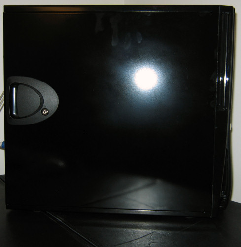
The front has been designed to keep functionality to a maximum while keeping as sleek a look as possible.
The drives are hidden behind a double-hinged lockable door, and the bottom half is cut in such a way that there are two large vents for air intake without them being very visible from the front. Towards the top of this half is the covered port cluster, which is flanked by two blue prismatic LEDs.




48 Comments
View All Comments
Quanticles - Thursday, September 8, 2005 - link
$200 for a case really isnt that bad when you're paying $400 for a GPU, $300 or more for a CPU, $200 on memory, etc etc etc. If you're building a budget system, then of course this would be a horrible buy. But if you're building a nice system, then you might want a nice case. I have a black v1000 w/ window and it looks great, and was great to work with. As far as noise, I have 4 120mm fans in here, but the system is nearly silent with the help of a cheap sunbeam rheobus.OvErHeAtInG - Thursday, September 8, 2005 - link
Exactly. Check out the V1100 , it comes with sound-damping precautions. I'm a 3-year user of the PC60 (old kind before they changed it) and I still love it. Yes, a little loud, but hey. Drooling on the V1100.flatblastard - Thursday, September 8, 2005 - link
...to only include one fan with their best-looking case. Then the P-180 comes with 3 fans, more features/functionality and doesn't really cost that much more than the sonata. I guess the Sonata is the better value overall considering the included PSU but damn that P-180 doesn't look too shabby either. Dang ole decisions, decisions...man, i tell ya whut....man, dang ole Antec man.swtethan - Thursday, September 8, 2005 - link
made the right choice buying one :-)imaheadcase - Thursday, September 8, 2005 - link
Because half of those cases just screamed "Burn me in the nearest fire!". lolI mean seriously, why do case manufactors make these crap cases, I would rather have a plain beige case than something made with freakin lights all on the outside covered with cheap plastic peices. Not to mention looks like they had there 3 year olds draw out the designs on ourside.
I don't care care if its the best case in the world inside, if its ass on the outside im not buying it. I can get the same thing in beige..hehe
Some of those look ok though..except.
1. Aspire: Oh please tell there designers to stop asking there 3 year old kids to do there work for them. This case screams crapplastic. it would prob melt if your coffee was to close..
2. Dynapower: This one does not look half bad, the drive bays could use a all black cover or a matching grill cover.
3. Sunbeam: Pretty cool looking case. Remove the lame blue circles though, all the stuff you can do when on the PC, who is going to glance at that anyways when most are on the floor or out of the way.
4.coolmaster: What would make it cool is without the pillars of salt on the side...hehe Remove those it would look sweet.
5. Both Antec cases: Looks good to me. Antec seems to make some nice cases in the budget area.
6. ThermalRock: What in gods name is that red circle for? That ruined the front of case, without that red circle it would look good.
7. Lian Li: Ohhhh Ahhhh! me likey alot.
Bonesdad - Thursday, September 8, 2005 - link
Gotta agree on the Coolermaster case...I got the Centurion 5 last year...glad I didn't wait. The older Centurion 5 is a really nice looking, well made case that looks like it was made for someone with a level of maturity over 16 years old. I can see using this case for many years to come...manno - Thursday, September 8, 2005 - link
you're not kidding out of all those cases the only ones I would touch with a 10' foot pole were the Antech's, and the Lian Li. For the love of god stop putting side windows on your cases it's drinking beer with a straw tacky.Tamale - Thursday, September 8, 2005 - link
a LOT of people still look for windows on the side - it's still a fad that's 'catching on' to most people.Quanticles - Thursday, September 8, 2005 - link
I have a window so I can check my watercooling easier. Besides, they look cool.ElFenix - Thursday, September 8, 2005 - link
no, they look dorktastic.