Valve's High Dynamic Range Explored
by Josh Venning on September 30, 2005 12:05 AM EST- Posted in
- GPUs
Image Comparison
For those used to the look of Half life 2 and Counterstrike: Source, the new HDR effects in Day of Defeat probably won't blow your socks off. The enhancements are subtle, but you can definitely tell that they are there. Most noticeable is the auto exposure effect, which simulates the way that the eye can be blinded slightly by stepping into the sun from a dark area. While some might complain that this is annoying, it seems to us that annoying or not, it adds another dimension to the gameplay. In other words, in a real battle, the sun in your eyes will affect your aim, thus adding to the realism of the game. The bloom effect is noticeable as well, and it is very effective at making light in the game seem brighter than it really is.
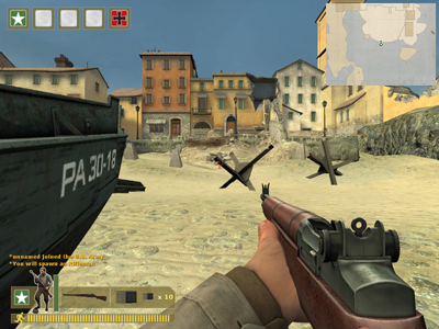
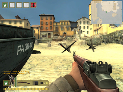
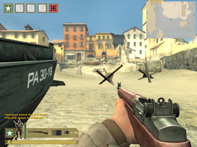
Below are some images that compare the different modes. The top-most image is with no HDR enabled, the middle image is with bloom only enabled, and the bottom is full HDR enabled.
At a glance, it's easy to tell that the image with full HDR enabled is brighter than the one with no HDR enabled, but the differences between the images are subtle. Pay special attention to the glare of the sun on the rifle, as this gives you a sense of the different levels of lighting. Notice how in the middle image (with bloom only enabled), the lighter colors in the distance on the buildings and sand are much brighter and create more contrast to the scene. And with the bottom-most image (full HDR enabled), you can see how the combination of the bloom and auto-exposure brighten the scene even more. This may seem very bright, but keep in mind that this is one of the widest spaces in any of the four maps. The game smoothly brightens or darkens the screen depending on where you are in the map, and the highest contrast ratios are observed when looking out of a dark area into a bright one (or vice versa).


47 Comments
View All Comments
OvErHeAtInG - Saturday, October 1, 2005 - link
The move to PCIe does make everything harder for them, though, as they would have to build a second box which would be as identical as possible except for a different motherboard, introducing a few potential inconsistencies. Other than that, my thoughts exactly.Although, frankly, this preview told me what I wanted to know. Great job, guys!!!
Hi - Friday, September 30, 2005 - link
IMO, bloom looks the best of all three screenshotsoverclockingoodness - Friday, September 30, 2005 - link
I personally like full HDR; to me, it's smoother.ksherman - Friday, September 30, 2005 - link
agreedbob661 - Friday, September 30, 2005 - link
I agree with the comments above. Looks too washed out. Not natural.Araemo - Friday, September 30, 2005 - link
Humorously enough, if you go to a bright beach on a bright day, the sand will look 'washed out'. Especially if you're viewing it through a TV camera(which limits the dynamic range of the image in a similar way that your monitor limits the dymanic range of the rendered scene.)Plus, this is generation 1 real-time HDR(sorta), don't be TOO hard on them. ;P Anti-aliasing was poo-poo'd early on because it 'made everything blurry'. I can't live without it in most games(As long as I'm playing at 1024x768 or above)
pol II - Friday, September 30, 2005 - link
...screenshots anyway. Just looks too washed out to me. Good to see that the technology is moving forward though.