The First Look, Continued
Moving past the more basic cosmetic changes, Microsoft has made several changes in Vista both as direct features and part of Aero in order to add functionality and improve usability/productivity, most of which require full Aero functionality to use. The most basic change among these has been a modification of ALT+TAB for switching programs, which has been given the formal name of Windows Flip. The main change here is that using the scaling abilities of Aero, each program shows up as a combination of its application icon and the active window of the application, giving the ability to see what's going on in the application you're about to switch to. This is most helpful when multiple copies of the same application are open. Microsoft previously implemented this as a PowerToy for XP, so some Windows users may already be familiar with it; while this feature was very slow on XP because of GDI+, the use of the compositing engine resolves this difficulty under Vista.
Also given a similar treatment has been the taskbar, which now can show you a preview of what running application you're mousing over. It's arguably similar to how Mac OS X uses a scaled version of a minimized window to represent the item in the dock, but since Mac OS X and Windows use slightly different paradigms for dealing with open applications, it's not overtly imitating the Mac. Interestingly enough, unlike some of the other productivity features, this one can easily be turned on and off as a preference.
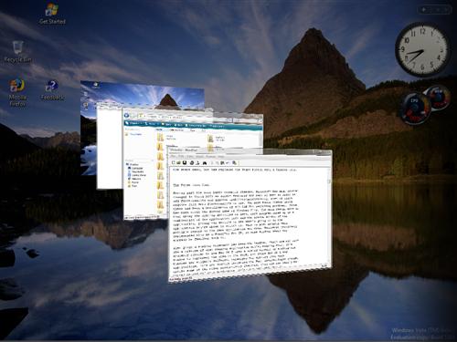
Last but not least on the list of productivity additions is a brand-new feature Microsoft is calling Flip3D. As the name would imply, it's what amounts to an enhanced version of Flip, but at the same time that would be an understatement. As you can see in the above screenshot, the biggest influence is clearly that of Exposé on the Mac - a utility attempting to help the user stay organized by seeing every open window at once - but Microsoft has gone in an entirely different direction in how they are presenting everything.
Activated via Win+Tab, Flip3D works like a rolodex of windows, with a mouse wheel (or repeated pressing of the TAB key) allowing the user to flip through the windows until they find the one they're looking for. However, this is one major case where we wish Microsoft would have just completely copied Apple, rather than trying to create their own implementation. Flip3D in its current incarnation is not at all a useful productivity tool because the rolodex design means that it can't really show everything at once like Exposé can. Having to wheel through things further hinders its effectiveness, as it's not as smooth an operation as simply using the mouse to select the desired window. For all you true nerds and geeks out there, Flip3D is an O(n) operation where Exposé is O(1). Lastly, for such a great emphasis on eye-candy in Aero, the rotated view of the windows is poorly thought out; by rotating the windows it creates aliasing which in spite of the power of modern video cards is not being removed. The artifacting around the window borders and the illegibility of the text simply make Flip3D ugly to look at and ugly to use. In this case, Microsoft simply would have been better off not implementing Flip3D than using this. We like Exposé, and a version of it in Windows would be very nice, but Flip3D is a second-rate copy at best, and ultimately does not function nearly enough like Exposé to be useful.
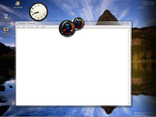
One last addition related to the overall look of Vista but not specifically a productivity tool is a new class of utilities called Gadgets. Here Microsoft's inspiration is very clear; if you've ever used Widgets on Mac OS X or Konfabulator on the Mac/PC, then you know what Gadgets are all about. For those of you new to the idea, Gadgets/Widgets are small JavaScript/XML powered applications that do one small feature, such as displaying the current weather conditions, CPU usage, etc. Here Microsoft has gone for a carbon copy implementation of Konfabulator's widget idea, with Gadgets residing on top of the desktop and visible when the desktop is brought to the front, or they can be brought to the front on their own by pressing Win+Space. Widgets have been a huge success both for Mac OS X and Konfabulator, so we're not the least bit shocked to see them implemented in Vista.
Moving past the more basic cosmetic changes, Microsoft has made several changes in Vista both as direct features and part of Aero in order to add functionality and improve usability/productivity, most of which require full Aero functionality to use. The most basic change among these has been a modification of ALT+TAB for switching programs, which has been given the formal name of Windows Flip. The main change here is that using the scaling abilities of Aero, each program shows up as a combination of its application icon and the active window of the application, giving the ability to see what's going on in the application you're about to switch to. This is most helpful when multiple copies of the same application are open. Microsoft previously implemented this as a PowerToy for XP, so some Windows users may already be familiar with it; while this feature was very slow on XP because of GDI+, the use of the compositing engine resolves this difficulty under Vista.
Also given a similar treatment has been the taskbar, which now can show you a preview of what running application you're mousing over. It's arguably similar to how Mac OS X uses a scaled version of a minimized window to represent the item in the dock, but since Mac OS X and Windows use slightly different paradigms for dealing with open applications, it's not overtly imitating the Mac. Interestingly enough, unlike some of the other productivity features, this one can easily be turned on and off as a preference.
 |
| Click to enlarge |
Last but not least on the list of productivity additions is a brand-new feature Microsoft is calling Flip3D. As the name would imply, it's what amounts to an enhanced version of Flip, but at the same time that would be an understatement. As you can see in the above screenshot, the biggest influence is clearly that of Exposé on the Mac - a utility attempting to help the user stay organized by seeing every open window at once - but Microsoft has gone in an entirely different direction in how they are presenting everything.
Activated via Win+Tab, Flip3D works like a rolodex of windows, with a mouse wheel (or repeated pressing of the TAB key) allowing the user to flip through the windows until they find the one they're looking for. However, this is one major case where we wish Microsoft would have just completely copied Apple, rather than trying to create their own implementation. Flip3D in its current incarnation is not at all a useful productivity tool because the rolodex design means that it can't really show everything at once like Exposé can. Having to wheel through things further hinders its effectiveness, as it's not as smooth an operation as simply using the mouse to select the desired window. For all you true nerds and geeks out there, Flip3D is an O(n) operation where Exposé is O(1). Lastly, for such a great emphasis on eye-candy in Aero, the rotated view of the windows is poorly thought out; by rotating the windows it creates aliasing which in spite of the power of modern video cards is not being removed. The artifacting around the window borders and the illegibility of the text simply make Flip3D ugly to look at and ugly to use. In this case, Microsoft simply would have been better off not implementing Flip3D than using this. We like Exposé, and a version of it in Windows would be very nice, but Flip3D is a second-rate copy at best, and ultimately does not function nearly enough like Exposé to be useful.
 |
| Click to enlarge |
One last addition related to the overall look of Vista but not specifically a productivity tool is a new class of utilities called Gadgets. Here Microsoft's inspiration is very clear; if you've ever used Widgets on Mac OS X or Konfabulator on the Mac/PC, then you know what Gadgets are all about. For those of you new to the idea, Gadgets/Widgets are small JavaScript/XML powered applications that do one small feature, such as displaying the current weather conditions, CPU usage, etc. Here Microsoft has gone for a carbon copy implementation of Konfabulator's widget idea, with Gadgets residing on top of the desktop and visible when the desktop is brought to the front, or they can be brought to the front on their own by pressing Win+Space. Widgets have been a huge success both for Mac OS X and Konfabulator, so we're not the least bit shocked to see them implemented in Vista.


75 Comments
View All Comments
rqle - Friday, June 16, 2006 - link
dont really need bad memory module, overclock the memory just a tad bit to give errors while keeping the cpu clock constant or known stable clock.JarredWalton - Friday, June 16, 2006 - link
That still only works if the memory fails. Plenty of DIMMs can handle moderate overclocks. Anyway, it's not a huge deal I don't think - something that can sometimes prove useful if you're experiencing instabilities and think the RAM is the cause, but even then I've had DIMMs fail MemTest86 when it turned out the be a motherboard issue... or simply bad timings in the BIOS.PrinceGaz - Saturday, June 17, 2006 - link
Erm, no. Just overclock and/or use tighter-timings on a known good module beyond the point at which it is 100% stable. It might still seem okay in general usage but Memtest86 will spot problems with it. Now see if Vista's memory tester also spots problems with it. Pretty straightforward to test.xFlankerx - Friday, June 16, 2006 - link
I love how I was browsing the website, and I just refresh the page, and there's a brand new article there...simply amazing.xFlankerx - Friday, June 16, 2006 - link
Masterful piece of work though. Excellent Job.