A Trio of Thermaltake Towers
by Joshua Buss on August 16, 2006 2:30 AM EST- Posted in
- Cases/Cooling/PSUs
Thermaltake Aguila - External
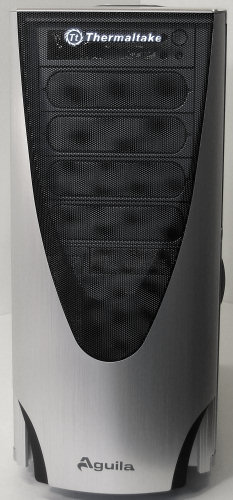
The Aguila takes a number of steps to really improve Thermaltake's offerings in the desktop case segment, starting first and foremost with a little more straightforward design on the front door.
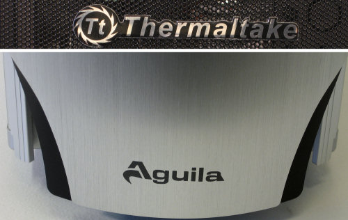
Both logos - the company's and the case's - are finished nicely and look great against the respective metal mesh and brushed aluminum.
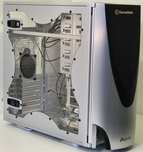
The Aguila is available in both silver and black, with and without a side window. Our silver model came with a side window, and for all practical purposes it's identical to the Eclipse DV's - extra fan ventilation and everything.
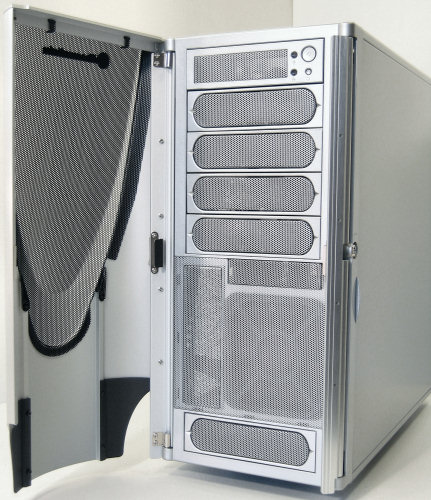
Taking design elements mostly from the Armor series, the Aguila front behind the door looks pretty familiar. With a full fledged door, things will truly be protected though, and should one want to remove the door entirely they will only be left with two much smaller flaps, (and even those can be removed as well if desired.) A vertically aligned 5.25" drive can be installed too, just like in the Armor Jr.
More like the Eclipse DV than the Eureka, opening the entire front panel of the Aguila is not only more useful but is even encouraged with true hinges and a lock specifically for this purpose.
This is how one would change the front fan filter and prepare the external bays for a drive. To that note, it should be mentioned that the bay covers for the external drives are all easily removed and reinstalled thanks to the use of real screws instead of snap-off metal pieces.
Instead of having extra ports on the side or front, the Aguila has them on top, just like the Armor. We're not too sure if the sleek pop-up cover was even necessary, but the protection from dust and food crumbs getting into the jacks will be appreciated by many anyway. In another 'nice touch' move, Thermaltake put the identifying symbols for each jack on the underside of the cover.
The Aguila takes a number of steps to really improve Thermaltake's offerings in the desktop case segment, starting first and foremost with a little more straightforward design on the front door.
 |
| Click to enlarge |
Both logos - the company's and the case's - are finished nicely and look great against the respective metal mesh and brushed aluminum.
 |
| Click to enlarge |
The Aguila is available in both silver and black, with and without a side window. Our silver model came with a side window, and for all practical purposes it's identical to the Eclipse DV's - extra fan ventilation and everything.
 |
| Click to enlarge |
Taking design elements mostly from the Armor series, the Aguila front behind the door looks pretty familiar. With a full fledged door, things will truly be protected though, and should one want to remove the door entirely they will only be left with two much smaller flaps, (and even those can be removed as well if desired.) A vertically aligned 5.25" drive can be installed too, just like in the Armor Jr.
 |
| Click to enlarge |
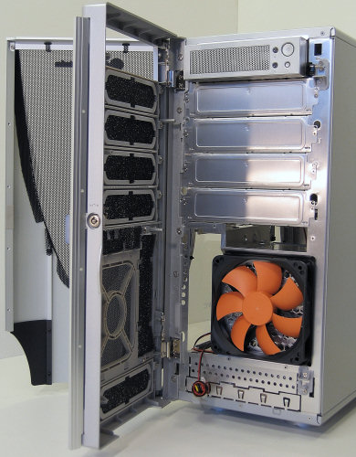
More like the Eclipse DV than the Eureka, opening the entire front panel of the Aguila is not only more useful but is even encouraged with true hinges and a lock specifically for this purpose.
 |
| Click to enlarge |
This is how one would change the front fan filter and prepare the external bays for a drive. To that note, it should be mentioned that the bay covers for the external drives are all easily removed and reinstalled thanks to the use of real screws instead of snap-off metal pieces.
 |
| Click to enlarge |
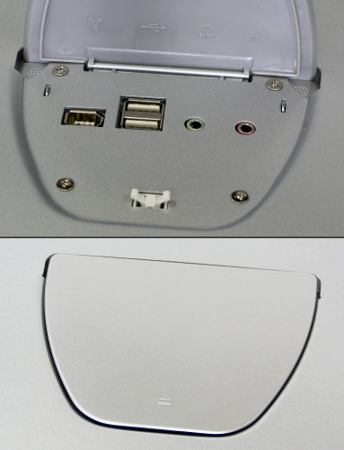
Instead of having extra ports on the side or front, the Aguila has them on top, just like the Armor. We're not too sure if the sleek pop-up cover was even necessary, but the protection from dust and food crumbs getting into the jacks will be appreciated by many anyway. In another 'nice touch' move, Thermaltake put the identifying symbols for each jack on the underside of the cover.


43 Comments
View All Comments
Griswold - Thursday, August 17, 2006 - link
The first one looks like some vertical hi-fi deck with a side window - and I hate side windows.Yuck indeed.
seven9sn10s - Thursday, August 17, 2006 - link
The Aguila has a measurement of 27dB(12" above) and subjective rating of 2/10.In a previous review, the Raidmax X1 & Antec P150 both a measurement of 45dB(12" above) & subjective rating of 2/10 & 2.5/10 respectively. The subject ratings to dB measurements do not seem to be on a consistent scale. Am I to believe that the Aguila is so much quieter than the Raidmax X1 or Antec P150?? Please clear this up. Thanks.
seven9sn10s - Friday, August 18, 2006 - link
Hello???Somebody please answer.. is this Aguila case far quieter than the Antec P150/Solo? Tryin to build a system here. Thanks.
poopoohead - Sunday, August 20, 2006 - link
yeah, me too! the measurement seems so low compared to any other case they have ever tested, even the Zalman HTPC that they said was very quiet? why does the article not make special mention of the aguila super quietness?Gholam - Thursday, August 17, 2006 - link
HEC 6A rebadge, Chieftec DX rebadge... pay once for the case, and twice more for a TT sticker. No thanks.Missing Ghost - Wednesday, August 16, 2006 - link
The Aguila with no window does not exist?! I thinkstthiel - Wednesday, August 16, 2006 - link
"There's a law on AnandTech case reviews: no matter what they might review, a bunch of people have to show up and grouse about how the cases look like crap, or they're nice looking but too expensive, or some other opinion followed by the statement that "no one would ever buy these...."So what your saying is people have different opinions...thats very insightful.
teng029 - Wednesday, August 16, 2006 - link
i like this case, although removable motherboard trays should be standard on cases these days.tthiel - Wednesday, August 16, 2006 - link
Those are some seriously ugly cases.eastvillager - Wednesday, August 16, 2006 - link
All bling, no zing.