A Trio of Thermaltake Towers
by Joshua Buss on August 16, 2006 2:30 AM EST- Posted in
- Cases/Cooling/PSUs
Thermaltake Aguila - Installation
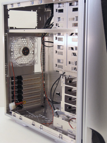
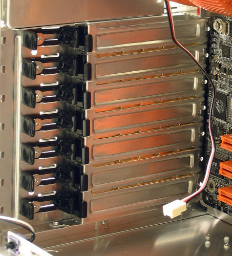
Looking towards the back of the case from the inside we can see the new clips Thermaltake has designed to hold expansion cards in place.
Notice how these simply slide laterally, putting pressure on cards in the exact direction that they need it, and how they can then be secured with the provided screws. It's a little clunky given the reliance on screws at all, considering if one has to use screws (period) they might as well use normal expansion card screws. However, even without using them the clips snap pretty tightly, so technically calling them tool-less is still somewhat correct. In any case, they're still an improvement over the sometimes downright incompatible green clips.
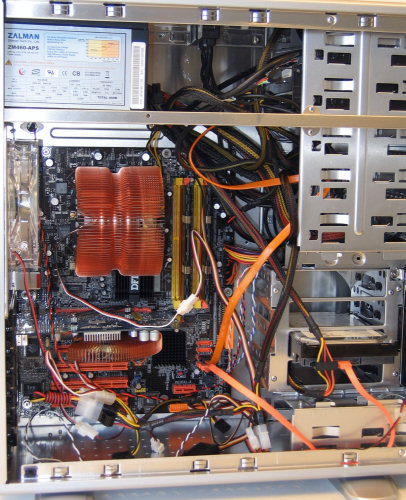
The actual install of our test bed into the Aguila was very straightforward. While we had a lot of options for the optical drive placement, nothing would have really compromised the ease of installation save for choosing the vertical bay.
This main image showing the completed build sure shows how a PSU with modular cables could really help keep cable clutter down to a minimum. Also note how it takes a decently long power cord to get to the SATA hard drives because of the sideways mounting design. All things considered there is still quite a bit of room to tuck extra cables out of the way though, and even using our side-facing IDE channel wouldn't be too difficult in the compact chassis.
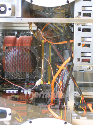
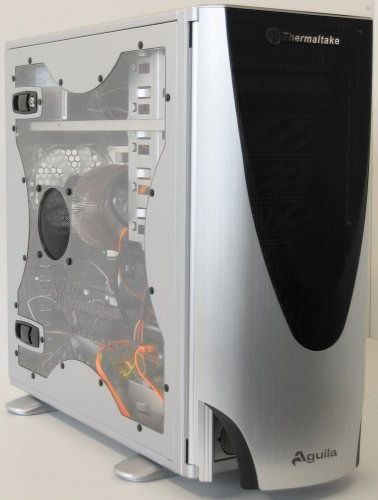
As for the view, with our windowed version of the case the install was plenty visible thanks to the good design of the window which also worked well on the Eclipse DV. Also, the side vent was placed well even if it's not completely necessary in our build.
After finishing the build we wanted to take another look at the finished product. While not quite as subdued as the Eureka, the Aguila overall has a simpler theme for its design than many of Thermaltake's latest cases, and choosing one of the two windowless options available with the case would only further this design direction. More importantly than the looks, however, is the fact that after everything is completely installed the computer felt very sturdy yet thankfully lightweight.
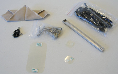
In the accessories area Thermaltake includes an optional PSU support bracket, more than enough case screws, the keys, and two more items a little less standard.
A micro-fiber cleaning cloth for the case will be appreciated by many, and small plastic films with self-adhesive tape can help ensure no contact is made with the case when using a BTX motherboard or components which stick out more than usual.
Looking towards the back of the case from the inside we can see the new clips Thermaltake has designed to hold expansion cards in place.
 |
| Click to enlarge |
Notice how these simply slide laterally, putting pressure on cards in the exact direction that they need it, and how they can then be secured with the provided screws. It's a little clunky given the reliance on screws at all, considering if one has to use screws (period) they might as well use normal expansion card screws. However, even without using them the clips snap pretty tightly, so technically calling them tool-less is still somewhat correct. In any case, they're still an improvement over the sometimes downright incompatible green clips.
 |
| Click to enlarge |
The actual install of our test bed into the Aguila was very straightforward. While we had a lot of options for the optical drive placement, nothing would have really compromised the ease of installation save for choosing the vertical bay.
 |
| Click to enlarge |
This main image showing the completed build sure shows how a PSU with modular cables could really help keep cable clutter down to a minimum. Also note how it takes a decently long power cord to get to the SATA hard drives because of the sideways mounting design. All things considered there is still quite a bit of room to tuck extra cables out of the way though, and even using our side-facing IDE channel wouldn't be too difficult in the compact chassis.
 |
| Click to enlarge |
As for the view, with our windowed version of the case the install was plenty visible thanks to the good design of the window which also worked well on the Eclipse DV. Also, the side vent was placed well even if it's not completely necessary in our build.
 |
| Click to enlarge |
After finishing the build we wanted to take another look at the finished product. While not quite as subdued as the Eureka, the Aguila overall has a simpler theme for its design than many of Thermaltake's latest cases, and choosing one of the two windowless options available with the case would only further this design direction. More importantly than the looks, however, is the fact that after everything is completely installed the computer felt very sturdy yet thankfully lightweight.
In the accessories area Thermaltake includes an optional PSU support bracket, more than enough case screws, the keys, and two more items a little less standard.
 |
| Click to enlarge |
A micro-fiber cleaning cloth for the case will be appreciated by many, and small plastic films with self-adhesive tape can help ensure no contact is made with the case when using a BTX motherboard or components which stick out more than usual.


43 Comments
View All Comments
cbuchach - Wednesday, August 16, 2006 - link
I have been looking to upgrade my case for some time now with my planned new build and really think the Aguila may fit the bill. Unfortunately the windowless version that I would be interested seems to be very hard to come by in the US at this time. We'll see.imaheadcase - Wednesday, August 16, 2006 - link
Yah been hard to find windowless one in the states, I found one but they inflated the price to like $300. lame.Budman - Wednesday, August 16, 2006 - link
One word. YUCKKalessian - Wednesday, August 16, 2006 - link
I don't understand why you would say that. The Eureka is very plain... what kind of cases do you like?I think a black Aguila would look great.
imaheadcase - Wednesday, August 16, 2006 - link
The agila is the only decent case, the others look like rejects from Voltron casting.Frumious1 - Wednesday, August 16, 2006 - link
There's a law on AnandTech case reviews: no matter what they might review, a bunch of people have to show up and grouse about how the cases look like crap, or they're nice looking but too expensive, or some other opinion followed by the statement that "no one would ever buy these...." Luckily, AnandTech seems to do a reasonable job of just presenting the facts on the cases and letting people decide for themselves whether or not they like how the case looks and would be interested in purchasing one.Too bad the Eureka is loud and cools the HDD/mosfets so poorly. Of course, I prefer a bit smaller cases anyway, and the Aguila looks pretty decent.
Frumious1 - Wednesday, August 16, 2006 - link
Oh yeah - I still don't trust the big orange TT fans. Things spin pretty fast and make a decent racket in my experience. Maybe some of them are better now, but the older 120mm dayglo orange things were pretty mediocre. I'm actually surprised any of these cases can manage to come in under 40 dB! Guy I know bought an Armor last year; freakin' turbine that thing is! Doesn't need to blow dry his hair if he angles the fans properly....tk109 - Wednesday, August 16, 2006 - link
I agree. They are ugly as butt.I saw the first one and I thought that maybe the rest will be better. But nope. One of them isn't too bad but I'd still not want to own it even if it was given to me. Like most of the case trends in recent years I think you have to be one of those super nerds to like em or something. They try way to hard on cases. Clean, straight, and simple is the way to go.
GoatMonkey - Wednesday, August 16, 2006 - link
Get yourself an iMac and be done with it then.
KorruptioN - Wednesday, August 16, 2006 - link
Or a Lian-Li.