Power Supply Roundup: 730W to 900W
by Christoph Katzer on November 22, 2007 3:00 AM EST- Posted in
- Cases/Cooling/PSUs
Product Comparison - Efficiency
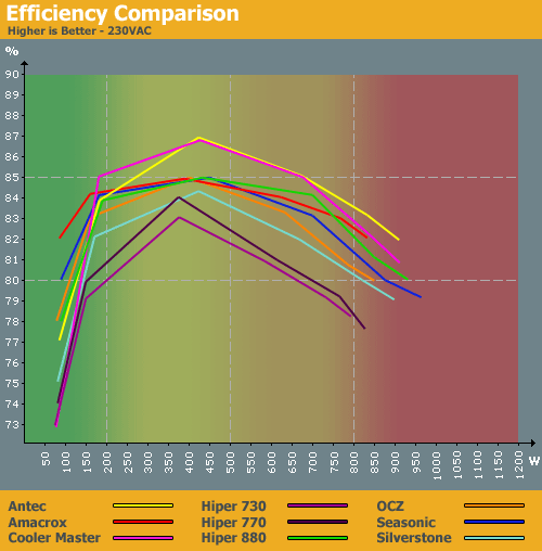
We have color-coded the background graphic to represent four classes of PSU. Category one is in the green and represents small to medium systems with a single lower power graphics card. The yellow range is for systems with a single graphics card, though possibly one of the more demanding models, as well as systems with a more powerful CPU (quad-core) and potentially more than one hard drive. The orange background is for systems with two graphics cards, possibly with a quad-core processor as well. Finally, we have the red category which is frankly very difficult to reach with normal home computers at the moment; serious overclocking, quad-core, and multiple GPUs can require this sort of power supply. This background will be used in future comparisons as well, and with the wattage figures as the X axis users will be better able to choose a power supply that offers high efficiency in the desired range.


Obviously, if you are running a normal setup with a single graphics card you will not need any of the units we're testing today. If you are using a typical dual-core CPU with a moderate graphics card (without overclocking), you will not need a power supply with more than 400W max output. Your system will likely draw 75W-125W in idle mode (perhaps slightly less), and with higher-end power supplies like what we're testing today you would get a relatively low efficiency rating. Only systems that are regularly using more than 200W should even consider these 730W and higher power supplies.
The two units with the best efficiency results today are the Antec and Cooler Master models, which are both manufactured by the same ODM. Many of the other models show similar results, reaching near 85% efficiency. The OCZ ModXStream 850W and the Hiper 730W and 770W take the bottom three curves at 120VAC; the Silverstone unit is also near the bottom on the 230VAC chart.


31 Comments
View All Comments
Christoph Katzer - Friday, November 23, 2007 - link
The arrangement will be changed next time ;)What about the amount of PSUs? Too many?
strikeback03 - Tuesday, November 27, 2007 - link
I like the voltage vs. load charts used previously better than the bar charts. Obviously impractical with a 10 PSU roundup, but I hope they come back for smaller articles.Would it at least be possible to keep a consistent order to the PSUs, instead of sorting by output voltage? On the 3.3V charts on page 4 for example, it's confusing to have the Hiper 730 at the bottom of the 20% chart then the top of the 50% chart.
Dayneaw - Thursday, November 22, 2007 - link
The first graph on page six seems to be missing the results of the silverstone.rickon66 - Thursday, November 22, 2007 - link
I love it when folks complain without even reading the review."Maybe you just forgot to upload the final page?"
Maybe you just forgot to read the review!!
Anyway-Good job on the review.
Talcite - Thursday, November 22, 2007 - link
Good job guys, the o-scope readings/explanations are particularly nice =D.SOLIDNecro - Thursday, November 22, 2007 - link
No "Final thoughts" or "Conclusions"???A summary report is one of the most important, if not most important part of any article, to leave it completely up to the reader to draw conclusions based on charts requires to much time and expertise for your average reader!
Also your "Editors" choice awards are invaluable, you guys are the "Pro's" and should be able to guide the reader to what you would purchase for your own rig, and why it stood out from the rest of the pack
Maybe you just forgot to upload the final page?
JEDIYoda - Thursday, November 22, 2007 - link
So whats so hard about making your own conclusion and thinking a little bit?Editor`s awards are bogus!
Grow up dude!
JEDIYoda - Thursday, November 22, 2007 - link
Editor choice rewards awards are bogus!You can read and comprehend - can`t you?
Make up your own mind!
Christoph Katzer - Thursday, November 22, 2007 - link
Just check the new arrangement. I wrote the comparison first and if somebody is interested to know more about a product he/she can check details after. The conclusion is on page 8.ChronoReverse - Thursday, November 22, 2007 - link
I find it rather confusing that way. I also thought that there was no conclusion until I read the comments.That said, I do usually read the conclusion first. Perhaps it should go back to the end and then a short abstract placed in the front?