iPod vs. Zune: January 2008 High End MP3 Player Roundup
by Ryan Smith on January 21, 2008 12:00 AM EST- Posted in
- Smartphones
- Mobile
Zune 80
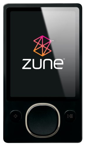
Last but certainly not least we have Microsoft's second-generation Zune, the Zune 80. If the iPod Classic is the old guard and the iPod Touch the new guard, then the Zune is the missing link, as its feature set includes items from both generations of products, with interesting results.

As the successor to the original Zune (30) which was developed prior to the Touch, the Zune 80 is best described as an attempt to build a bigger, better iPod Classic; AKA the proverbial iPod killer. The original Zune launched with fairly tepid reviews thanks to a combination of poor design choices with both the hardware and the software. Since then Microsoft has gone back to the drawing board and heavily revised the Zune's hardware for the Zune 80, and taken out many of the kinks in the Zune software, which has also been pushed out to the original Zune as an update. The result is that their second generation Zune is immediately a much stronger contender than the original Zune was.
At $249 for the Zune 80, the Zune 80 is clearly targeted against the 80GB iPod Classic which retails at the same price and features the same 80GB 1.8" hard drive. Microsoft seems content to leave Apple alone at the $349 price point for the 160GB iPod Classic.
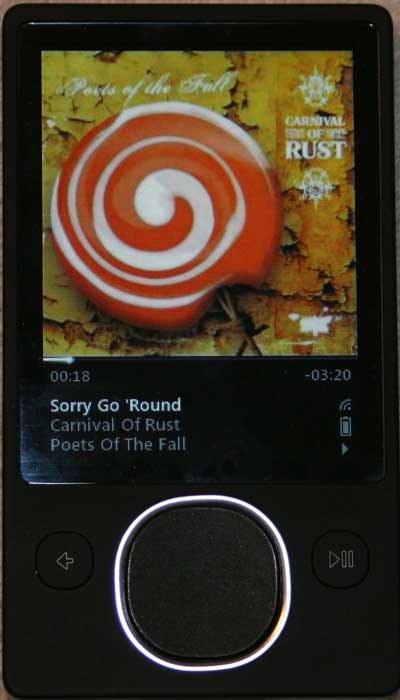
One of the biggest complaints with the original Zune was the controls, and that's where we'll start. The original Zune used a d-pad in the shape of a circle along with buttons on the left and right sides, something that would seem to be more at home on a Windows Mobile PDA than a MP3 player. The d-pad's successor in the Zune 80 is a touch-sensitive pad (the Zune Pad) in the shape of a squircle. Notably, the Zune Pad is only a single button, emulating the previous Zune's d-pad by reading the location of the thumb when the Zune Pad is pressed.
On the whole the Zune Pad is a mixed bag. The lack of touch controls on the original Zune were a massive mistake and this makes up for it greatly, as it's now far easier to quickly navigate through lists thanks to the ability to flick your finger along the Zune Pad to launch the list up or down. The biggest shortcoming in its design however is the Zune Pad just isn't very accurate. Because the Zune Pad uses touch loaction to figure out what d-pad action it should be emulating (or if it should be emulating a centered button press), we continue to have periodic issues accidentally scrolling up/down as we press the button because the Zune Pad reads our thumb actions as a flick while we're pressing the button. Through a month's practice we've learned how to better work with the Zune Pad to try to avoid such accidents, but we haven't been able to stop them completely. This particularly manifests itself during blind navigation, making that task harder than it should be.
Less significant is the fact that Zune Pad is hard to get a read on in terms of sensitivity; every now and then the Zune Pad is reading small motions as bigger than they are meant to be. Much of this has to do with the fact that the Zune Pad is fairly small (1" diameter) and requires repeated motions to use, so the device has brief 1" motions to decide what's going on. In all fairness to Microsoft, this is a case where they're between a rock and a hard place with what Apple has done. The iPod scroll wheel is simply a fantastic design, it's very comfortable and easy to use, with no significant problems in our opinion and none of the issues we've had with the Zune Pad. But we believe Microsoft can't outright copy the scroll wheel both because Apple's legal team probably won't let the idea go without a fight and because there's a certain level of harm that would come to Microsoft's reputation if it was such an obvious copy.
So what we get is the Zune Pad, to the detriment of the Zune 80. Don't get us wrong, it's not terrible (if you want terrible ask us about a Rio, any of them), it's just not great either; it's better than the first Zune and still not as good as the competition. Ultimately it's not possible to avoid fighting with the Zune Pad at least once, which is a tough sell in the iPod age. We should note that you can turn the touch-sensitive features of the Zune Pad off, which would solve some of our problems, but then we'd just be back to a d-pad.
Moving on, we come to the UI of the Zune. In all honesty we don't have much to say about the UI because we're largely content with it. Its anti-iPod design is rather obvious at times, starting with the white-on-black design compared to the iPod's black-on-white design, but at the end of the day it accomplishes the same things and works out rather well. Hierarchies are very solid designs for a MP3 player interface, and this is what Microsoft sticks to. If you've used any other MP3 player then you're not going to immediately know where everything is, but once you've used one hierarchical design you've basically used them all and will quickly adapt to the Zune.

The only thing keeping us from calling the Zune UI a draw with the iPod Classic's (it's basically incomparable to the Touch) are two nagging issues with it that we're having. First is a matter of design, Microsoft decided to shorten the hierarchy some by making song groupings a horizontal list across the top with the elements appearing below, skipping the need to actually traverse deeper. In practice this saves a short amount of time traversing the UI, but it also has the side effect of not making all of the groupings visible at once. What are the grouping methods and how many clicks/flicks do we need to make to get to the one we want? Because they're not all on the screen at once, you can't tell without going through them all. It's only a problem for new users, but it's a problem none the less.

The other issue we have is with the responsiveness of the UI. Most of the time it's fast, but not always; certain actions such as traversing through the song grouping methods too quickly will result in a UI that feels sluggish - never slow but sluggish. It's not enough to significantly impact the usability of the Zune, but it is enough to be annoying. Who ever heard of a MP3 player being sluggish? It just shouldn't be happening.


50 Comments
View All Comments
ThePooBurner - Tuesday, January 22, 2008 - link
Since the article is on current gen, we should only compare current gen. So you can't say apple is superior because of it's touch wheel when creative has the same. My Zen, the Vision:M is a few years old and can be had for under 200$. For that you get video playback of more formats (and an included transcoder for formats that aren't natively supported) than the Ipod, an FM tuner, a Microphone for dictigraphing, an 8gig jump drive that is seperate from the 30gig main drive, and jump dive like operation for the 30gig main drive, so you can use it on any computer. As far as i know, the Ipod has non of this without buying extra parts. I like the GUI of the Zen better than the Ipod by a lot, though the zune's GUI is actually pretty nice in places. Plus, Creative practically invented sound. I would wager that the sound quality and output, etc. are superior on the Zen compared to the other players as well. My music sounds good n matter what i have hooked to it to produce the sound, be it headphones, speakers, or even a TV. Even sounds great when using my 20$ FM transmitter for playback in my car. Plus my battery lasts for ever. I've gotten fairly close to 24 hours of operation. Granted time depend on a few things, as I've gotten as little as 14 also, but i know that the capability is there to meet the advertised claims, or better. And the 60gig version has even more features than mine does!Actually, other review sites, when my version of the Zen came out, said everything i have said and added "Creative has once again created a superior product to everyone else, but will the market give it the credit it deserves, or will it be like Beta? only time will tell."(that's a paraphrase from memory, so forgive if it isn't 100% exact). In short, the Zen is Better and cheaper than the competition. In every way.
michael2k - Wednesday, January 23, 2008 - link
So you want to compare to today, or a few years old?Because from the Creative web site, only the flash players are in stock. The Vison M, Vision W, and even the Zen are out of stock.
But a theoretical comparison of the Zen M vs the iPod classic shows us that the iPod is smaller and more pocketable, has more storage, and longer battery life. A comparison of the Zen W with the iPod Classic shows that the Classic is still smaller and with a better control scheme, more storage, and better battery life.
Of course what you say about the Vision:M may have been true in 2005 when it was announced... except that even then the iPod was thinner, had greater storage, and similar or better battery life.
So sure the "lead" may jump back and forth every time a refresh is announced, but Apple has "consistently" lead; first with USB mass storage, first with smaller form factor, first with faster connectivity, and first with easier usability. Eventually (2004 really), Creative caught up with their Zen but by then Apple had a huge lead.
So your point, while valid, is also outdated. Look today; if your Vision:M broke, what would you buy? The iPod would be a very strong contender.
yyrkoon - Monday, January 21, 2008 - link
Well I did not read the whole article, and only read part of the closing thoughts, but from what I have read, you guys have your priorities wrong compared to what most of the people I have talked to, and have seen on the web are saying. At least concerning the audio player aspect.A lot of people are wanting a device that is simple as possible concerning putting music on it, and a device that also has good quality sound(read: clean, with no background hissing or hum etc, etc). Anyhow, most of what I have read indicated that people would rather pay less for a Creative Stone, or something similar that was small, played music decently, has decent ear buds, and dead simple drag n drop file transferring. A good portion of these people also seem to want a device that does not cause music to stutter/pause on a device while navigating through menus, or folders while looking for a song, or settings.
The problem with the two reviewed items in this article is that I have read that the software that comes with each device is garbage. And they are not alone, as many MANY devices suffer from the same affliction from what I have read.
Anyhow, Creative has DEFINITELY been in this part of the industry much, much longer than Apple, or Microsoft, and so has Sony(Although I must admit I have not had a Sony Walkman in many, many years, but I still have one of the first Creative MP3 players ever with 32MB of memory on it).
I think now days, and personally, I would rather have something that is small, but not tiny, sounds decent, has a USB chargeable battery onboard(I dont have a problem taking such a device apart and replacing the battery myself; if and when it is needed), and somethin g that has drag and drop file transferring with the ability to play any music format whether DRM or not. IF this device were an all around media device, then it MUST have the ability to read PDF files. More than 2-4GB on such a device would be a waste for me however, so we are talking onboard flash, and probably a 8-10 hour battery play time before recharges.
TP715 - Monday, January 21, 2008 - link
You might want to take a look at the Cowon D2 and A3. Both have drag and drop and support many audio codecs. D2 is small, available in 2, 4, and 8GB (can increase via the SDHC slot), has USB chargeable battery with 52 hr life and will display TXT files (but not PDF as yet). A3 is probably bigger than you want, but will display DOC and PDF files (with transcoding).Others: AnandTech did mention that this is only the first of reviews on MP3 players, so others will probably be covered. I would suggest they look at Cowon as well as Creative Zen etc. They are available only online, are a bit expensive, and have nonstandard UIs, but they have good audio quality and lots of codec support (incl OGG, FLAC, APE etc.). The also support recording, ie line in.
michael2k - Monday, January 21, 2008 - link
I think 119m iPods sold disagree with you.1) Sound quality (if you read the whole article you will see) on the Classic (and correspondingly Nano and Shuffle) iPods are fine.
2) Drag and drop works fine for a couple hundred megabytes (IE, a handful of folders or files) up to a couple gigabytes of files, but falls way short when there are several to tens to hundreds of gigabytes of files. iTunes is then simple (plug and go)
3) The problems described with stuttering/pausing is new, and will probably be fixed. The first 5 generations of iPods did not have this problem.
Anyway, you're welcome to your device. It sounds like you're describing an iPod Touch, so long as you can stand iTunes.
michael2k - Monday, January 21, 2008 - link
I think you need to recognized that for some people the included earbuds fit perfectly.Freeseus - Monday, January 21, 2008 - link
There's something that I haven't seen mentioned in many of these iPOD reviews that I find very annoying. I'm sure I'm not the only one here. Or perhaps, I simply missed over it as I perused this article (as well as previous ones on other sites).The iPOD UI has significant slowdown/pauses/sluggish "stutter" playback while accessing music, particularly when:
a: attached to a transmitting device (iTRIP, for example)
b: while accessing a long or high-quality song
Many a time I find myself waiting to see the data appear and waiting to see the song begin to play. I don't even need to mention the album art in the new Classic, which suffers the same problem as iTUNES does in general with displaying custom artwork as you scroll through your music.
And in the latest CLASSIC generation of iPODs, the "stutter" is at least twice as bad as it was in the previous generation.
Why has this not been mentioned? I considered getting a ZUNE simply because I was tired of the lacking capabilities of the iPOD's processing/coding. But, I haven't purchased a ZUNE simply because there is no 160gig model.
The newest iPOD classic is a step down from the previous generation. It needs a cleaner, less intense UI and/or some more powerful hardware. End of story.
Ryan Smith - Monday, January 21, 2008 - link
It wasn't mentioned because I never experienced it on the 6G hardware. I also own a 5G where I have experienced it, so I see where you're going, but I have never had that issue with the Classic used in this review.cmdrdredd - Monday, January 21, 2008 - link
I find that anandtech has fallen into Apple's traps like so many others. The iPod is hardly the be al end all of players anymore. Hell, the Zune has a FM tuner which Apple expects you to pay for in an accessory. The Zune also bundles earbuds that actually sound good, no Apple's pack in ear buds are nowhere the quality. Plus, I don't have to do the "safely remove hardware" to disconnect my zune, I can just unplug it. Doing that with your iPod can corrupt it completely. The battery life on the Zune I find better than mentioned here. Turn off the WiFi if you don't use it. On the touch if you use the web features it's necessary, but mostly for the Zune you don't need it. It's not ment to do the functions the iPod Touch does via wifi so having it on is unfair in the comparison. The zune has flaws too like the screen not being very high rez for it's size, and inability to put videos into a playlist. The latter of which is easily fixed via software update.The Zune also has the bonus of not using a case that is easily scratched.I also find the UI to be more eye pleasing than the iPod classic because of the ability to customize the background.
I'm honestly just a little sick of people writing off everything else as an option and telling everyone else to just buy an ipod because it's "cool" or "it's an ipod, duh". That's the same as telling everyone to buy a Wii, even when the Wii doesn't have the games people buy an Xbox360 for.
lefenzy - Wednesday, March 5, 2008 - link
I agree with you about the ipod not being the best, but I've never had an issue pulling out my ipod nano without safe renewal.