Apple’s 45nm Refresh: New MacBook & MacBook Pro
by Anand Lal Shimpi on February 29, 2008 12:00 AM EST- Posted in
- Mac
Glossy or Not?
With the exception of the MacBook Pro, all of Apple’s notebooks are available exclusively with a glossy display. The benefit of a glossy display is an improved contrast ratio but the downside is it reflects more ambient light, particularly when you have an unusually strong light source (e.g. sitting in front of a window or being outside with the Sun).
With the MacBook Pro you have the option of either a glossy or anti-glare display, the question that remains is: which should you choose?
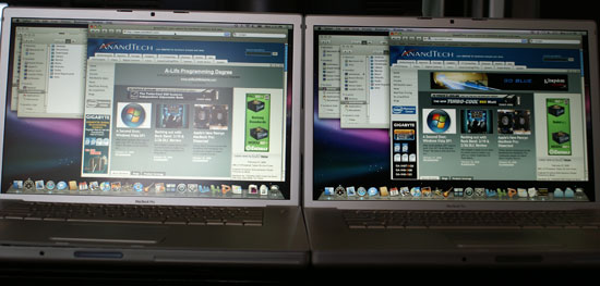
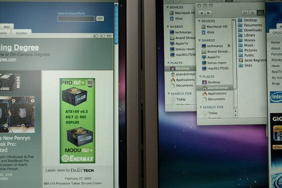
As you’d expect, the decision really falls upon your intended use for the notebook. Indoors, the glossy display was much nicer in my opinion. Blacks appeared blacker and the screen was much more pleasant to look at:

Matte screen (left) vs. Glossy (right)

Matte screen (left) vs. Glossy (right)
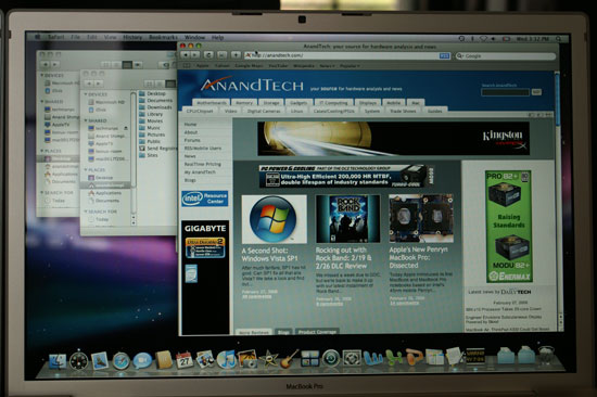
Unfortunately the glossy screen can get pretty annoying when there's glare on it:

Glossy, see the window reflection on the left?
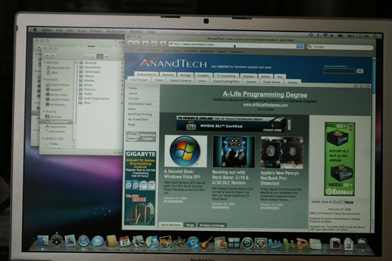
The matte anti-reflective screen just gets a little washed out but doesn't reflect its environment when presented with glare:

I still end up preferring the glossy screen but I don't use these things outside that often. If I were still using them outside on campus I might have to opt for the matte screen instead.
Cases, we need Cases
I can’t stress how important it is for Apple to start building good cases for its notebooks. Apple has done a tremendous job on styling its notebooks yet they are confined to the same cases that even the most generically designed PC notebooks are destined for. Many of Apple’s notebook peripherals are also not of standard shapes or sizes (e.g. the power brick), paving the way for even more synergy through a well designed custom case.
The MacBook Air needs a custom case to avoid losing the point of one of its biggest features. Who cares if you can stick the Air in a manilla folder if you have to carry it around in a standard laptop bag?
The MacBook and MacBook Pro are no different, although not as extreme of examples as the Air. These notebooks feature a very well proportioned shape and are as attractive as you can get in a computer (I’ll refrain from using the word sexy since, well, they don’t incite any sexual desire despite being well styled computers), yet they are carried in ugly, not well designed bags.
Apple seems to have the design sense to tackle such a thing, although I’m not sure if it really wants to get into the notebook case business. I figure that it spends so much time and effort on making sure its packaging is among the most stylish on the planet, why not create some packaging that you can actually take with you?


51 Comments
View All Comments
tayhimself - Friday, February 29, 2008 - link
You also called the 2299 version 2199Doormat - Friday, February 29, 2008 - link
A quick question - the yonah Core Duos had really really poor battery life in the review. Were those performed recently with new batteries? The MB itself is nearly 2 years old.Still, 4 hours is amazing on the DVD tests. I could stop watching movies on my iPhone and use my laptop on the entire transcon flight... though I think I'll wait for the Montevina platform. Hopefully the SFF chips, 25W CPUs and additional graphics horsepower will be worth the upgrade.
alpaye - Friday, February 29, 2008 - link
Well it seems that these upgrades you call "tick upgrades" are mostly to keep up with the technology. They don't seem to be a must upgrade for people like me, as I own the last "tock version" of MBP. Nice review, good points.The Unofficial Mac (http://www.unofficialmac.com)">http://www.unofficialmac.com)
TestKing123 - Friday, February 29, 2008 - link
A comparison with non-Apple notebooks would be nice as well.AMDJunkie - Friday, February 29, 2008 - link
This is what I miss! Horribly cornball sex jokes (no point in calling it innuendo), genuine reporting of personal experience (shock at a kernel panic; admitting your exhausted because you've written a review at some godawful morning hour, for example), and snark (iWork is for converting your work into Office). And yet there's a half-decent review in there! It's like reading a blog, but with content!PlasmaBomb - Friday, February 29, 2008 - link
Tocks happen every two years not once a year...
Anand Lal Shimpi - Friday, February 29, 2008 - link
woops, that's what I meant :)Yearly tocks and I'm pretty sure we'd be well on our way to skynet by now :-P
Take care,
Anand
InternetGeek - Friday, February 29, 2008 - link
Apple will introduce a new 'revolutionary' Macbook in every tock, and some improved models on every tick. I wonder if Intel might be interested in having Apple use the 'Intel inside' logo? That'll be interesting.It'll be interesting to see how these MacBooks perform once some PC games are also ported to the Mac (Unreal and so)...
joey2264 - Friday, February 29, 2008 - link
The Macbook has an absolutely horrible keyboard. You can't possibly, rationally, reasonably, believe that this is not the case, especially with all your experience reviewing computers. The absolute crap Dell keyboards that they used to use in their notebooks are far better.I hope you mention somewhere in your review the ridiculousness of Apple releasing a 5.3 pound notebook with a 13.3 inch screen and integrated graphics.
Dennis Travis - Friday, February 29, 2008 - link
I have been using computers and almost every keyboard known to man from the Commodore 64 too todays keyboards find the keyboard on the Macbook and their external keyboard that is like the one in the Macbook two of the best I have ever typed on. I can fly on either of them.Keyboards are more of a personal thing as people are very different, but the Macbook has an excellent keyboard. Sorry I agree with Anand.