Apple's Redesigned MacBook and MacBook Pro: Thoroughly Reviewed
by Anand Lal Shimpi on October 22, 2008 12:00 AM EST- Posted in
- Mac
Oh No, It's Glossy
Glossy screens are in, unfortunately. They look cooler and can improve contrast ratio in normal lighting conditions, but they are extremely reflective. Apple offered a matte option on the previous generation MacBook Pro, but both the base MacBook and the Air came with glossy screens standard. With the new MacBook and MacBook Pro Apple switched to a thin glass covering in front of the display, giving the system a more updated look. I'm not sure functionally if there's any benefit to the glass exterior but it looks cool. Both the MacBook and MacBook Pro have this glass outer layer, although the two notebooks use different physical LCD panels (more on that later).
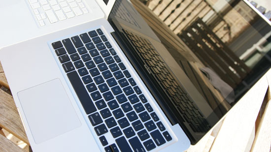
That's not a mirror baby, it's a display
People have complained about the new glossy screens a lot, but let's see how bad they really are. While the obvious comparison would be between the old and new MacBooks I want to start by comparing the new MacBook to the first generation matte MacBook Pro to put the glossiness into perspective for those of you who don't have a previous generation MacBook:
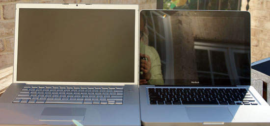
MacBook Pro matte (left) vs. the new MacBook (right)
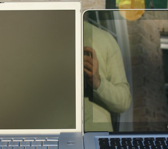
MacBook Pro matte (left) vs. the new MacBook (right)
Hello reflections! If you're used to a matte screen, this thing is going to bug the hell out of you. Now let's toss the old MacBook Pro's glossy option into the mix:
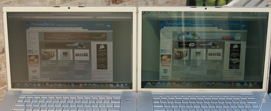
The old MacBook Pro matte (left) vs. the old MacBook Pro glossy (right)
The older glossy screen is definitely harder to read outdoors, but indoors (or in the shade) I actually prefer it to the matte screen. Let's look at how the old glossy display compares to the new glass covered glossy one:
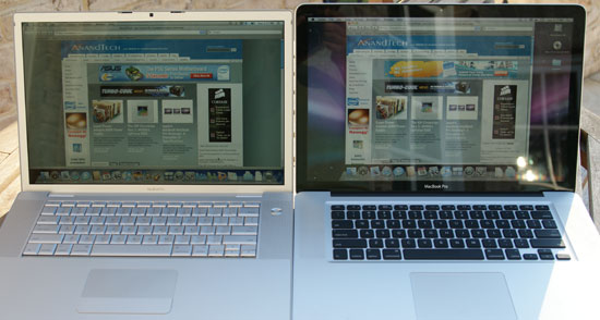
The old MacBook Pro glossy (left) vs. the new MacBook Pro on the right (do I even need to call it glossy?)
Reflections-a-plenty on the new display; while the brightness somewhat makes up for it the display is still more distracting than not when outside. I still prefer the glossy displays indoors thus in my opinion the best balance was actually the previous generation MacBook Pro's glossy display. The new one is just a little too nuts - unfortunately you don't really have a choice.
Compared to the previous generation MacBook we have the same problem: the new display is extremely reflective:
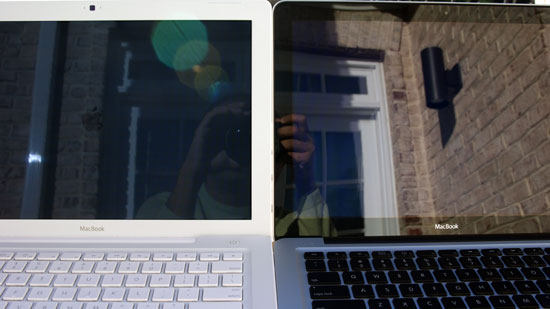
MacBook old (left) vs. MacBook new (right)
There are definitely situations where the new displays are unusable outside, especially compared to a notebook with a matte display. Note that these pictures were taken with the sun behind the screens, not in front, so simply turning your torso won't fix these problems. The best solution is to find some shade to work in, or to pick a laptop without a glossy screen. My MacBook Air has a glossy screen that pretty much guarantees writing in direct sunlight is impossible, so I'm used to working in the shade but it is a valid concern.
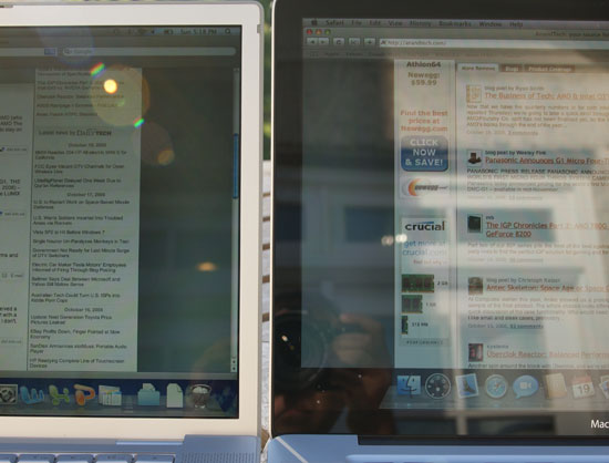
MacBook old (left) vs. MacBook new (right)
Note that there are also situations where even the older MacBooks aren't usable outside:
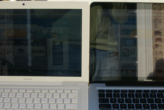
Part of the problem is the black border around the display. This part is also covered in glass but it's not backlit, making reflections even more visible there. Compared to the aluminum or plastic border in the previous MBP/MB notebooks, this border looks great but makes reflections seem worse.
I tend to do most of my writing indoors, but if I were still in school and writing on campus the glossy screens would be a definite issue. I saw a quote from Apple saying that the new displays are bright enough to make up for the additional glare; as the pictures above show there are definitely situations where this isn't true.


66 Comments
View All Comments
Imaginer - Wednesday, October 22, 2008 - link
And you have the options of the new iMirror or the new iMirror! :PBut all iJokes aside, this article did not really had me until it is mentioned of the new trackpad. Initially, I thought that Apple went off the deep end by going from one button to NO buttons. But in the end, the right and left click is simply a finger or two down away from touching the pad to make the click.
It is a SHAME that Anand had many troubles with the fickleness of the pad - and even moreso in Windows. Big deal breaker (alongside the annoyance of the newly adopted displayport with no included adapter (nickel and dime? at the very least monitor manufacturers include BOTH the DVI and VGA cable with each monitor, wmy not Apple?).
Features aside, I do agree while that many (including myself) equate Apple to the USSR of the computing world, they do put together a nice OVERALL package compared to other manufacturers. Next revision Apple.... you almost had me with this one... ALMOST. Get your windows stuff and hardware support together and well talk (yes and that includes supporting ALL of your "gestures" in the Windows platform too - yeah fat chance in hell).
ltcommanderdata - Wednesday, October 22, 2008 - link
The Windows issues should hopefully be fixed with the next BootCamp driver update.But I have to agree about the glass/glossy reflectiveness. I really hope Apple brings back a matte option, which is unlikely, or at least find some way to reduce the reflectivity in the next refresh.
andreschmidt - Wednesday, October 22, 2008 - link
The first reports are coming in at MacRumors and they are definitely Samsung SSDs...didn't they use that horrible controller?Voldenuit - Wednesday, October 22, 2008 - link
"In testing the first batch of Centrino 2 notebooks that Jarred received he noted that he can't seem to find a mainstream notebook with a 50 - 60WHr battery that can come close to offering the sort of battery life you get out of the Macs."You're not looking hard enough. The lenovo thinkpad T400 registered 6.5 hrs with wireless on using a 56 WHr battery.
http://www.notebookreview.com/default.asp?newsID=4...">http://www.notebookreview.com/default.asp?newsID=4...
That's about 30% longer than the Macbook Pro.
JarredWalton - Wednesday, October 22, 2008 - link
"With the T400 you can reach 9 hours and 41 minutes with the wireless enabled, screen backlight at 60%, and the laptop in integrated graphics mode using only the 84Wh 9-cell battery. In this situation the notebook is only consuming roughly 8.5 watts of power. In dedicated graphics mode under the same settings battery life falls by exactly 2 hours down to 7 hours and 41 minutes, and power draw increases to 10.5 watts. The 6-cell battery managed 6 hours and 4 hours and 28 minutes respectively."No mention is made of actually *surfing* the web - WiFi is merely enabled. Without knowing more about how they conduct their battery life testing, I can't say whether their numbers are comparable to ours. What I do know is that on the notebook I mentioned in an earlier comment, battery life almost doubles (142 minutes vs. 261 minutes) when I go from web surfing to idle.
quanta - Wednesday, October 22, 2008 - link
The buttonless mouse is the dumbest idea. For example, if I have to press 1 finger for left click, 2 fingers on the pad for right click, how do I press both buttons? In addition, if scroll is done by moving 2 fingers, how does it not get confused with dragging with right mouse button? Furthermore, the lack of tactile feedback also reduces productivity. So much for another innovative design.aj28 - Thursday, October 23, 2008 - link
1) Why would you need to do a simultaneous left and right click?2) Why would you drag with the right mouse button? (also refer to below)
3) It DOES have tactile feedback. The whole trackpad is a depressible button...
Take your biased ideas elsewhere, thanks. Apple does good for the PC industry and provides an alternative to Microsoft-based solutions. Whether they're better or not is entirely a matter of opinion, but the bottom line is that they provide competition, and competition is good for everyone.
hb18 - Saturday, October 25, 2008 - link
Another good use of simultaneous button clicks is mouse gestures in web browsers.Johnmcl7 - Thursday, October 23, 2008 - link
1 - For pasting in *nix applications, at least that's what I use on a conventional mouse.2 - Right click drag in Windows lets you choose the file behaviour (move, copy, create shortcut) whereas a standard left click drag will just do a default action.
John
headbox - Saturday, October 25, 2008 - link
1. newflash: this isn't *nix. There's nothing preventing you from getting a mouse either.2. keyboard shortcuts are faster than mouse actions. Get to know them.