Apple's Redesigned MacBook and MacBook Pro: Thoroughly Reviewed
by Anand Lal Shimpi on October 22, 2008 12:00 AM EST- Posted in
- Mac
Display Analysis Indoors
The glossy issues don't apply nearly as much indoors since you don't usually have a sun in your room, thus our focus turns to viewing angle. With the previous generation MacBook the poor viewing angle of the panel kept me from really recommending the notebook. You couldn't tilt the screen far back enough to get a good viewing angle with the laptop in a plane for example.
The first noticeable change is that you can tilt the screen back a lot more on the new MacBook and MacBook Pro, helping to alleviate some of the viewing angle issues on the MacBook (the Pro still uses a much better panel with significantly better viewing angle).
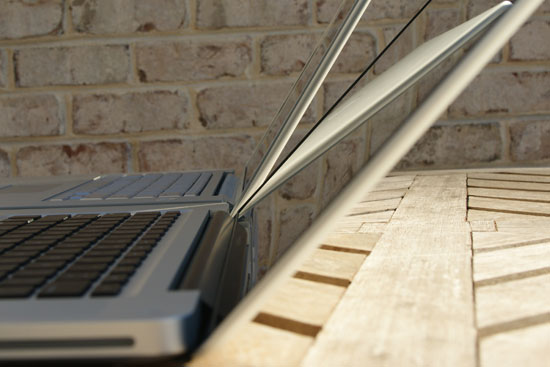
The old MacBook Pro (back) vs. the new Macbook Pro (front)
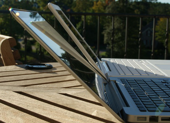
The old MacBook (back) vs. the new MacBook (front)
The new MacBook panel is definitely improved in general; while it's not perfect the LED backlight helps a ton. Here's a comparison between the new MacBook and the old one:
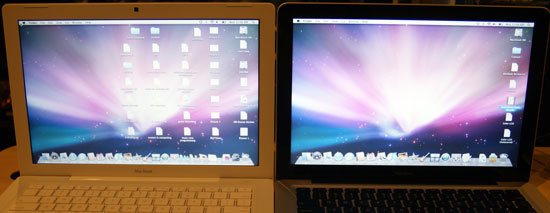
The new MacBook (right) doesn't look as washed out as the old MacBook (left)
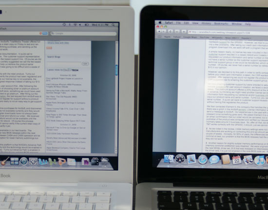
The old MacBook (left) isn't as bright as the new MacBook (right)
Now here's an interesting comparison, let's look at the old MacBook vs. the old MacBook Pro:
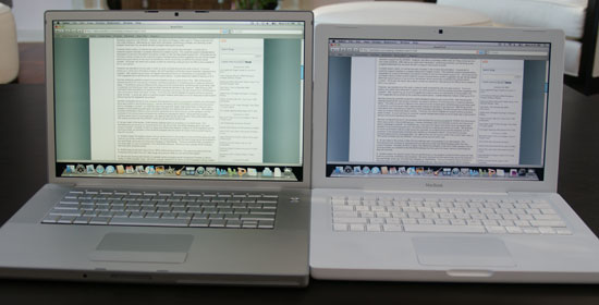
The old MacBook Pro (left) vs. the old MacBook (right)
Straight on we see warmer colors on the MacBook Pro (left) but at this angle everything looks fine. At a more ridiculous angle you can get an amplified picture of the problem with the old MacBook:
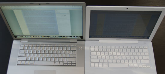
The old MacBook Pro (left) vs. the old MacBook (right)
Both of these displays are at full brightness, but the MacBook (right) is hardly visible. This is clearly an extreme case but even at smaller angles you still notice a lot of washout on the old MacBook's display. Now let's do the same comparison with the new MBP and MacBook:
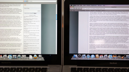
The new MacBook Pro (left) vs. the new MacBook (right)
Head on we see the same differences in panels, the MacBook Pro has much warmer colors than the MacBook. Let's see what happens if we go to a more extreme viewing angle though:
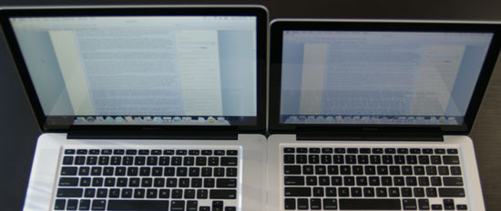
The new MacBook Pro (left) vs. the new MacBook (right)
The MacBook gets a bit darker but nothing near as bad as what we saw with the old MacBook, showing the sort of improvement that Apple has made this generation. The new MacBook finally has an acceptable display. While I wouldn't consider the old MacBook because of the display, the new one is improved enough that I'd actually be ok with it. I've written most of this review on the new MacBook and while the old one would've frustrated me by this point, the new one was just fine.
The MacBook Pro does offer some definite benefits in low light viewing however, let's take a look at black levels when watching a movie:
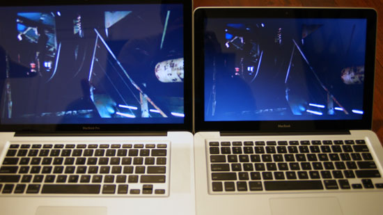
The new MacBook Pro (left) vs. the new MacBook (right)
Here everything looks ok, but let's go to a more extreme angle and cut the lights off:
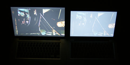
The new MacBook Pro (left) vs. the new MacBook (right)
Both screens are quite visible in reality at a normal viewing angle, but the MacBook Pro is definitely better.


66 Comments
View All Comments
Imaginer - Wednesday, October 22, 2008 - link
And you have the options of the new iMirror or the new iMirror! :PBut all iJokes aside, this article did not really had me until it is mentioned of the new trackpad. Initially, I thought that Apple went off the deep end by going from one button to NO buttons. But in the end, the right and left click is simply a finger or two down away from touching the pad to make the click.
It is a SHAME that Anand had many troubles with the fickleness of the pad - and even moreso in Windows. Big deal breaker (alongside the annoyance of the newly adopted displayport with no included adapter (nickel and dime? at the very least monitor manufacturers include BOTH the DVI and VGA cable with each monitor, wmy not Apple?).
Features aside, I do agree while that many (including myself) equate Apple to the USSR of the computing world, they do put together a nice OVERALL package compared to other manufacturers. Next revision Apple.... you almost had me with this one... ALMOST. Get your windows stuff and hardware support together and well talk (yes and that includes supporting ALL of your "gestures" in the Windows platform too - yeah fat chance in hell).
ltcommanderdata - Wednesday, October 22, 2008 - link
The Windows issues should hopefully be fixed with the next BootCamp driver update.But I have to agree about the glass/glossy reflectiveness. I really hope Apple brings back a matte option, which is unlikely, or at least find some way to reduce the reflectivity in the next refresh.
andreschmidt - Wednesday, October 22, 2008 - link
The first reports are coming in at MacRumors and they are definitely Samsung SSDs...didn't they use that horrible controller?Voldenuit - Wednesday, October 22, 2008 - link
"In testing the first batch of Centrino 2 notebooks that Jarred received he noted that he can't seem to find a mainstream notebook with a 50 - 60WHr battery that can come close to offering the sort of battery life you get out of the Macs."You're not looking hard enough. The lenovo thinkpad T400 registered 6.5 hrs with wireless on using a 56 WHr battery.
http://www.notebookreview.com/default.asp?newsID=4...">http://www.notebookreview.com/default.asp?newsID=4...
That's about 30% longer than the Macbook Pro.
JarredWalton - Wednesday, October 22, 2008 - link
"With the T400 you can reach 9 hours and 41 minutes with the wireless enabled, screen backlight at 60%, and the laptop in integrated graphics mode using only the 84Wh 9-cell battery. In this situation the notebook is only consuming roughly 8.5 watts of power. In dedicated graphics mode under the same settings battery life falls by exactly 2 hours down to 7 hours and 41 minutes, and power draw increases to 10.5 watts. The 6-cell battery managed 6 hours and 4 hours and 28 minutes respectively."No mention is made of actually *surfing* the web - WiFi is merely enabled. Without knowing more about how they conduct their battery life testing, I can't say whether their numbers are comparable to ours. What I do know is that on the notebook I mentioned in an earlier comment, battery life almost doubles (142 minutes vs. 261 minutes) when I go from web surfing to idle.
quanta - Wednesday, October 22, 2008 - link
The buttonless mouse is the dumbest idea. For example, if I have to press 1 finger for left click, 2 fingers on the pad for right click, how do I press both buttons? In addition, if scroll is done by moving 2 fingers, how does it not get confused with dragging with right mouse button? Furthermore, the lack of tactile feedback also reduces productivity. So much for another innovative design.aj28 - Thursday, October 23, 2008 - link
1) Why would you need to do a simultaneous left and right click?2) Why would you drag with the right mouse button? (also refer to below)
3) It DOES have tactile feedback. The whole trackpad is a depressible button...
Take your biased ideas elsewhere, thanks. Apple does good for the PC industry and provides an alternative to Microsoft-based solutions. Whether they're better or not is entirely a matter of opinion, but the bottom line is that they provide competition, and competition is good for everyone.
hb18 - Saturday, October 25, 2008 - link
Another good use of simultaneous button clicks is mouse gestures in web browsers.Johnmcl7 - Thursday, October 23, 2008 - link
1 - For pasting in *nix applications, at least that's what I use on a conventional mouse.2 - Right click drag in Windows lets you choose the file behaviour (move, copy, create shortcut) whereas a standard left click drag will just do a default action.
John
headbox - Saturday, October 25, 2008 - link
1. newflash: this isn't *nix. There's nothing preventing you from getting a mouse either.2. keyboard shortcuts are faster than mouse actions. Get to know them.