Windows 7: Release Candidate 1 Preview
by Ryan Smith and Gary Key on May 5, 2009 11:00 PM EST- Posted in
- Systems
Giving Windows a Facelift: New GUI Features Abound
Last, but certainly not least on our whirlwind tour of Windows 7 RC1 is the new GUI. Although we’ve listed a number of significant changes Microsoft has made to the internals of the OS for Windows 7, it’s the GUI changes that Microsoft is pushing the heaviest. By reworking the GUI Microsoft it shooting to improve the GUI responsiveness, along with adding more features to keep parity with Apple in the eye-candy wars. It also doesn’t hurt of course that with these GUI changes Windows 7 looks a good deal less like Windows Vista, which helps Microsoft keep attention off of Vista when it comes time to talk about Windows 7.
Anchoring the GUI changes is the new Windows 7 taskbar, which marks the biggest change to the taskbar since it was introduced in Win95. In a nutshell, the taskbar just became a whole lot more like Mac OS X’s Dock. Application entries on the taskbar have been collapsed to just their icon by default, with multiple instances of an application sharing the same icon representation. This is combined with the new pinning ability, which replaces Quick Launch shortcuts. When an application is pinned to the taskbar, it will launch in-place; in other words the pinned item is now its active taskbar item rather than a separate item being created on the taskbar. This makes the new taskbar operate nearly the same as the Mac OS X Dock, which pioneered this behavior several years ago.
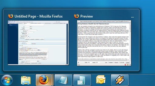
Handling multiple instances of a single app
Notably, Microsoft has managed to avoid some of the Dock’s pitfalls, which is a welcome change. Items on the Dock tend to shift around when the dock gets crowded in order to keep the Dock centered. Microsoft in comparison has designed the taskbar to be left-shifted, which means new items go into the next available space on the right. Ergo existing items don’t get moved around by new items. The only exception to this rule is when the taskbar is completely full, in which case it will start compressing things together to make room.
Joining the taskbar is a new feature called jump lists, which also has its roots in Mac OS X. The jump list replaces the normal right-click menu that comes up when clicking on an item in the taskbar, and is based around the concept of the jump list containing custom controls for an application, alongside the generic window manipulation options. A screenshot works better than words here, so let’s start with that.
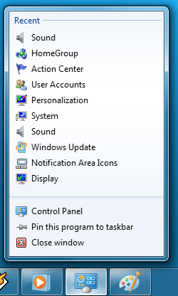
The Control Panel Jump List
As an application needs to be coded to take advantage of jump lists, any advanced functionality that moves beyond window manipulation is limited at this point to the handful of Microsoft applications implementing jump list support. The most common use for jump lists will be showing recently used items for a specific application, which in turn is intended to replace the Recent Items collection in the Start Menu (it’s still there but it’s disabled by default). Thus far a couple of applications, most notably Windows Media Player, have implemented further jump list functionality, also serving proof of concept implementation for 3rd party developers. The WMP jump list includes music controls while the Getting Started control panel lists all of its component items as tasks.
Jump lists also show up in the Start Menu, where recent applications with jump list support will have those lists available as a sub-menu attached to the application. The boys (and girls) at Microsoft seem rather proud of jump lists, but their success is largely out of Microsoft’s hands. For jump lists to be successful in the long run, developers need to start using them such that a critical mass is reached and jump list use becomes a standard feature. In spite of having similar functionality in Mac OS X, Apple has never pushed the issue and as such few programs use their implementation and few people even know it exists.
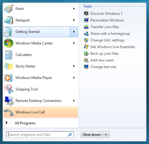
Jump Lists in the Start Menu
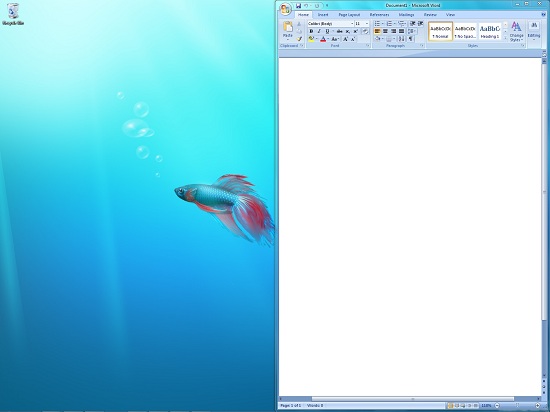
Also new are two window management features, Aero Snap and Aero Shake. Neither of these are Exposé clones (come on guys, you could take the dock but not Exposé?) so we’ll get that out of the way right now. With Aero Snap, Windows now recognizes when windows are being dragged to the edge of the screen, and treats that as a special action (not unlike Mac OS X’s hot corners). When a window is dragged to the top of the screen it’s maximized, and when a window is dragged to the left or the right it’s enlarged/tiled in such a way that it takes up the half of the screen it was dragged to. Pulling a window away from the side of the screen that it was dragged to reverts the window back to the way it previously was.
Meanwhile Aero Shake is the more oddball of the new window management features. When you shake a window (I’m being serious here) it causes all other application windows to become minimized. Shake the window again, and everything is restored. To Microsoft’s credit we're not immediately aware of any exact analog to this features (perhaps Mac OS X’s Hide All?) so it’s certainly unique. Whether it’s useful however….
It should be noted that while both of these features have “Aero” in the name, they’re not actually tied to Aero and the DWM. They work just as well with the Basic GUI, albeit without the eye-candy animations.
Gadgets have been relocated as of Windows 7. They’re no longer constrained to the Windows Sidebar (which has gone away completely) and can now be placed anywhere on the desktop, similar to how Yahoo! Widgets operates. As the Sidebar always felt out of place in Vista, this is a nice change to how gadgets are dealt with on Windows. With the removal of the Sidebar the internal workings of the gadget feature have also been tweaked – gadgets no longer get their own process and instead share a single process. This helps Microsoft in achieving their goal to bring down Windows’ memory usage, but it means that a rogue gadget can bring down the rest. Meanwhile gadget-haters will be glad to know that with the Sidebar gone, and the OS no longer loads the gadget process (which is still called sidebar) by default. The process is only fired up when a gadget is attached to the desktop, saving yet more memory and shaving a few seconds off of the Windows boot time.
With the change in gadget functionality, one last new feature has been added to the taskbar (and as a keyboard shortcut) to make it easier to access the gadgets. Aero Peek, as Microsoft calls it, is a small button on the right of the taskbar that makes all application windows transparent when hovered over, allowing users to see (i.e. peek at) the gadgets on their desktop without actually messing with any application windows. Clicking the button then minimizes all application windows so that users are free to interact with the gadgets (or anything else on the desktop for that matter), and clicking it again restores the application windows.
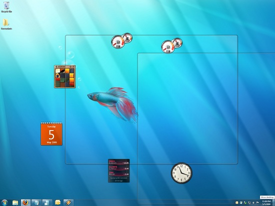
Using Aero Peek To Look At the Gadgets
This specific feature makes interacting with the gadgets much more like Mac OS X’s Dashboard, which is a separate space where only Mac OS X widgets reside. There’s a big difference in keeping gadgets/widgets on the desktop versus in a separate dashboard, but with the addition of Aero Peek the absolute functionality becomes quite similar. The desktop in this case is Windows’ dashboard.
As for the Start Menu, it has not seen any big changes for Windows 7, but it has seen some minor functionality reduction. For those hold-outs still using the classic Start Menu, it has finally been removed with Windows 7. The modern Start Menu is now the only option.
Finally, the overall theme of the GUI has been changed for Windows 7. Gone is the pea green highlighting and artwork found in various Explorer and Control Panel panes, to be replaced with a more neutral blue/grey styling reminiscent of Apple’s metal themes. If something was green by default in Vista, it’s blue by default in Windows 7. Most of the color choices in Windows 7 can be adjusted through themes just like it could with Vista, although like Vista some items are static images and as such Windows 7 always retains some of its blue styling.
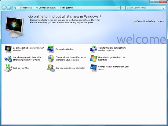
The new Welcome Screen, an example of the Windows 7 GUI style
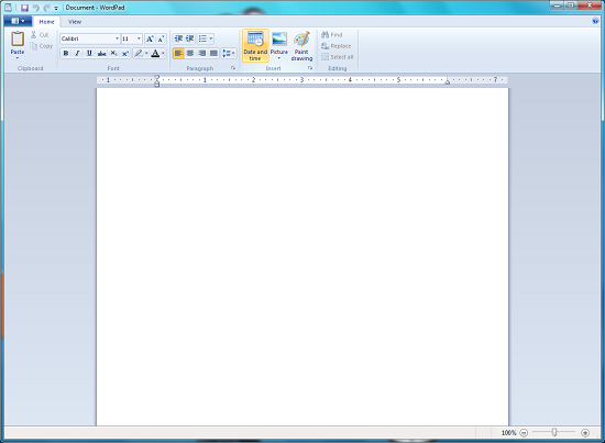
The ribbon interface from Microsoft Office has also made its way over to Windows 7, showing up in a handful of applications. Paint and WordPad are the most prominent examples of this change, as the use of ribbons required a facelift for each. The ribbon has been pretty popular with users once they become accustomed to it, so it’s likely that Microsoft will continue to slowly deploy it in more applications as time goes on. Presumably it will become the dominant interface in Windows at some point in the future.




121 Comments
View All Comments
ssj4Gogeta - Wednesday, May 6, 2009 - link
Exactly what SkullOne said. I also use Linux and know in what areas it's better than Windows. But I also know there are so many other areas in which it's a pain to use.SkullOne - Wednesday, May 6, 2009 - link
Spoken like a true jaded Linux fanboi. People like you are the reason Linux will never be mainstream. You think you're so high and mighty (or more secure) when you're not.Thanks for the laugh. I'd love for you to back up ANY of your comments with facts.
Disclaimer: I use Linux and Windows every day in production environments. They both have their place in the world.
snookie - Wednesday, May 6, 2009 - link
This blaming of Microsoft's Vista woes on Apple and a few commercials is just ridiculous. Most people pay no attention to such things those few that see them. It also has nothing to do with why Vista was a flop in the consumer space and an even bigger flop in the corporate marketplace. Certainly nothing to do with so many companies offering XP downgrades. Vista is a lousy product plain and simple and if there is any marketing fault it is Windows with their arcane multiple editions at ever increasing prices designed to milk customers. People aren't stupid even if they are computer novices. They know when they have been had, something is difficult to use, or not reliable. This is the result of years of piling layer upon layer of code on an ever expanding code base with no effort to start over and offer a clean efficient OS. The ONLY thing Windows 7 has over Vista is the interface is simplified and gets out of your way better. It can SEEM to run faster all it wants but test after test shows Windows 7 is barely faster than Vista at many tasks and in fact slower at some. Microsoft is in real trouble here because years of cruft code have left a huge amount of unusable code that consumes resources, adds instability, and provides entry to all sorts of malware. There is no way this codebase can be made to work efficiently with the quad and higher core procs that will be even more common in the next few years and what is Microsoft going to do then? They have three failed ad campaigns under their belt so their years of lying to their customers has fallen flat and corporate customers long ago stopped believing anything Microsoft said which is why open source that doesn't lock you in is becoming more and more prevalent. Microsoft has met the enemy and it is them.I notice you run Microsoft ads btw.
ssj4Gogeta - Wednesday, May 6, 2009 - link
I know so many people who haven't even TRIED Vista once and they keep telling other people how bad it is.formulav8 - Wednesday, May 6, 2009 - link
I agree almost 100%. I have customers who wants to make sure they have/get windows xp because vista is so bad. If you ask them why, they basically say its because a friend of a friends father said it was slow.I do know one of the biggest downfalls for Microsoft and Vista was allowing Intel to pressure them into getting Vista Certified compatability with those trashy integrated chipsets of Intel. So many users have those trash Intel xtreme/gma video chipsets and they had very bad Aero interface performance.
Anyways, I use both Vista and Windows7 daily. I like Vista better than XP overall and like Windows7 thus far compared to Vista.
I really think Windows7 will end up being one of the best oses made, even when compared to osx and windows xp.
Jason
vectorm12 - Wednesday, May 6, 2009 - link
Personally I never took to windows XP nor vista(had it been tecnologically possible I would still have been on WinNT 4.0), however as I bought a new PC I hit the RAM cap of 32bit XP Pro and therefore felt I had no decent choice than to move to 64bit Vista.My Vista experience has been far from great, reinstalls, crap drivers from nVidia and ATI not to mention a bunch of other third parties. However it hasn't been all bad, vista has quite a few ideas that just didn't work out just the way I would have liked.
Look at the save file dialogs for example where you actually had to click a button to browse directories other than the default one.
I've now been running on Win7 x64 since build 7k reinstalling almost every time a new version has been leaked and I'd say most of the things that bugged me with Vista has been corrected.
At this point the only thing I still want for Win7 is the "old" style control panel and an integration of the "administrator tools" into the control panel.
Looking at the big picture I say Win7 (even in BETA) is the best modern OS Microsoft has produced. The performance issues of Vista have been dealt with to a large degree. Drivers seem to work better and the most annoying GUI issues have been dealt with.
All Microsoft can do now to make me feel completely satisfied with my computing experience over the last few years is give me a BIG rebate on the upgrade to Windows7 from my old Vista licence.
johnsonx - Wednesday, May 6, 2009 - link
I just upgraded my XP-era Vista box (2.2ghz single core A64, 2GB RAM, VIA AGP mobo, X1950Pro) to Windows 7 tonight, and it was absolutely painless. It certainly seems faster than Vista, in particular I notice that my e-mail client and web browser launch and become ready much more quickly.I'm finding the new UI features to be actually useful as well, rather than Vista's pointless eye candy. I often have 6 or 7 browser tabs and several e-mail windows open, along with another couple of apps, and the new task bar makes it much easier to switch among them. I can see if I have any new e-mail just by moving the mouse over the client icon on the taskbar, no need to even click on it. Aero-Peek makes gadgets more usable too, since you can see them without minimizing every window. AeroSnap is great too. Only AeroShake defies explanation, but perhaps time will prove that one too.
I was never a Vista hater, though it certainly had it's frustrations. But it only took me 20 minutes with Windows 7 to never want to touch another Vista box again.
I was initially concerned that ATI's Windows 7 driver only supports cards back to the HD2000 series (presumably because the WDDM 1.1 driver model requires DX10 class hardware, which my X1950Pro is not), but the MS provided driver had no problems with Half-Life 2 (the only game I happen to have installed on this box) or any of the fancy GUI features.
The only weirdness so far as that at last boot up Windows told me a driver for Trend Micro Internet Security was being blocked due to a compatibility problem with Windows 7. That's understandable, except for the fact that I don't have any Trend Micro product installed, nor has one ever been installed in the past. It wouldn't tell me exactly what driver it was complaining about though, so I can't investigate further (I suspect some log somewhere will tell me exactly what driver it blocked).
One taskbar UI incontinuity: so much now works by simply moving the mouse over the various items, it suddenly seems odd to have to actually click on the start menu to get it to open.
johnsonx - Wednesday, May 6, 2009 - link
ok, it turns out the offending driver was TMCOMM.SYS, and it really was from Trend Micro. I have a vague recollection of running an online scan once a couple years ago (trying to scan a friend's external drive), so I guess it was trend micro and it left that driver around.As with most such things, the blocking event was neatly logged in the system event log.
thebeastie - Wednesday, May 6, 2009 - link
Wow, this new OS looks like Vista but with all the latest patches,IE8 and DirectX11. Then just a few cosmetic graphics changes.I AM EXCITED!
Come on what else did you expect? Maybe its something that has stuck deep in side people since they were kids around new PCs but when it comes to Microsoft new OSes people are just getting more and more nieve.
thebeastie - Wednesday, May 6, 2009 - link
More tests appear to be slower in Windows 7 then Vista etc.Things like reltek sound performance can be put to just as much to the 3rd party drivers then anything else.
I can't believe how many people I have talked to that use but hate Vista and expect Windows server to be light on its feet as XP but with the features of Vista, they are behaving as its something they could bet their life on.
What does it take for people to get some some technical intuition?
I mean thats what people really really really need here.