Biostar TPower i55 – Super Middle Weight Contender
by Rajinder Gill on November 25, 2009 12:00 PM EST- Posted in
- Motherboards
Video
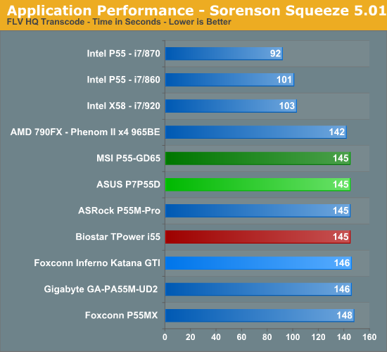
Sorenson Squeeze 5.01
We are using Sorenson Squeeze to convert eight AVCHD videos into HD Flash videos for use on websites. This application heavily favors core count and processor clock speed.
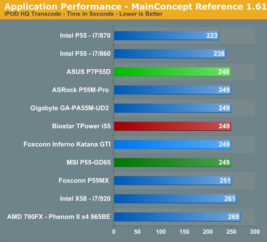
MainConcept Reference 1.61
One of our favorite video transcoding utilities is MainConcept Reference. We set our profile to iPOD HQ NTSC and then transcode a 651MB 1080P file to a iPOD friendly 34.7MB file.
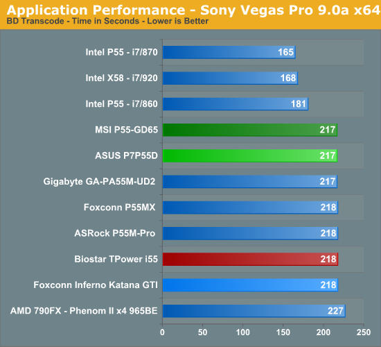
Sony Vegas Pro 9.0 x64
We transcode a 370MB 1080AVCHD file using the Mainconcept MPEG-2 1920x1080 60i, 25Mbps setting with 6-channel audio.
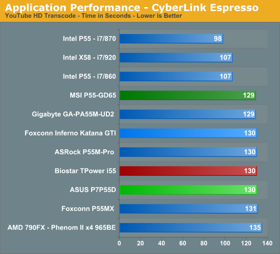
CyberLink MediaShow Espresso
We transcode a 370MB 1080AVCHD file into a HD friendly file suitable for publishing on YouTube. This program features GPU hardware accelerated decoding via ATI Stream or NVIDIA CUDA but is disabled in our test routines.
Audio
Sonar Producer 8 x64
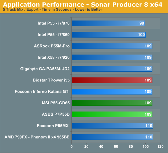
We utilize Sonar Producer extensively at home when mixing various music tracks. This test performs a complex mix of five individual tracks into a single title. We covert these tracks into a WAV format utilizing a 192kHz sample rate along with all other options enabled. This title thrives on memory bandwidth.
iTunes 9 x64
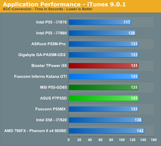
We import the album Tommy by The Who to our disk in WAV format. The directory consists of 25 songs totaling 751MB. We then convert this music collection to MP3 format utilizing 320Kbps VBR Highest audio settings or to an AAC format using the iTune Plus option.


39 Comments
View All Comments
treesloth - Monday, December 7, 2009 - link
I first used the internet when the main protocol was IP over smoke signals, so keep your fancy "flexibility" off my lawn!Seriously, though, good points. I also have to compliment Anandtech on basing their article layouts on visitor convenience, as opposed to the many sites that seem to try to herd as many visitors as possible into as many page views (and ad impressions) as possible.
Rajinder Gill - Thursday, November 26, 2009 - link
Yes, the summary/conclusion is on the first page. For the exact reason that Bull Dog mentions. We've had a lot of requests from people that want 'bare all' on the first page, so here it is. Saves you having to trundle through every page picking up tidbits here and there of what the board can or cannot do. We know it won't appease everybody, but then appeasing everybody is impossible anyway..lolregards
Raja
poohbear - Thursday, November 26, 2009 - link
I think it doesnt make sense. who says u hafta "trundle" through every page to get to the conclusion?? u just click the drop down menu & go to the conclusion. A site for computer enthusiasts & the readers can't even figure out how to use a drop down menu????Devo2007 - Thursday, November 26, 2009 - link
I agree - the new layout is confusing.What I'd suggest is a small summary of the article (either Pros/Cons, or small highlights of the product being reviewed. That way, people can get a quick overview of the product, and delve into the article more if they wish.
Putting the full-fledged conclusion on the main page just doesn't seem to fit right.
Rajinder Gill - Thursday, November 26, 2009 - link
I'll try and find a happy medium that does not confuse people too much..loltreesloth - Monday, December 7, 2009 - link
Put the conclusion right in the middle-- page 10 of a 20-page review. Oh, and since programming languages can't seem to settle whether indexing should start at 0 or 1, we'll compromise and start at .5.Seriously, though, I think people will get a little confused exactly once, figure it out, and never have another problem. I like the new way.
sonci - Thursday, November 26, 2009 - link
Its called abstract,its used on medical articles..
Rajinder Gill - Thursday, November 26, 2009 - link
Whichever way you look at it; you click on the review, read the first page for everything relevant and then if it interets you to lo at the figures, read on. Can't get much simpler than that.later
Raja
Bull Dog - Wednesday, November 25, 2009 - link
First/second page conclusion.Kinda wierd but I like it over the standard "go through 11 gazillion pages of nearly meaningless numbers."