Dell UltraSharp U2711: Quality has a Price
by Jarred Walton on January 22, 2010 2:00 AM EST- Posted in
- Displays
Brightness and Contrast
For the brightness, contrast, and color accuracy tests, we depend on a hardware colorimeter and software to help calibrate the displays. We use a Monaco Optix XR (DTP-94) colorimeter and Monaco Optix XR Pro software. Dell advertises a typical contrast ratio of 1000:1 and a maximum contrast (using dynamic backlight adjustment) of 80000:1. We're not interested in dynamic contrast, so we used the Adobe RGB setting for the results below. For those that are wondering, the reason we don't like dynamic contrast is that CCFL backlights take time to settle in and provide a consistent output, and if a display is constantly modifying the backlight level you won't get accurate colors.


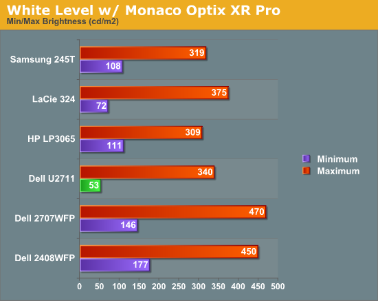
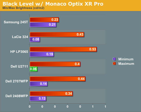
Don't pay too much attention to the white/black graphs, as they are merely reference points for how the displays perform at certain settings. Like many other LCDs, the U2711 has a "normal" brightness level of around 260nits (the Adobe RBS setting defaults to 50% brightness and contrast), which is more than sufficient and is actually brighter than what most users prefer to use in an office environment. You can reach the advertised 350nits (give or take) if you max out brightness and contrast.
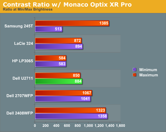
We're more interested in the contrast ratio, and here we find that the U2711 doesn't quite reach the advertised 1000:1 but instead comes closer to 850:1. We would have liked to see black levels a bit lower to improve the contrast, but really anywhere above 750:1 is difficult to see the difference, and 500:1 is sufficient for most users. At lower brightness settings, the contrast ratio improves to the point where our 100nits "print" result (~13% brightness) actually reached the advertised 1000:1 contrast ratio.
Power Requirements
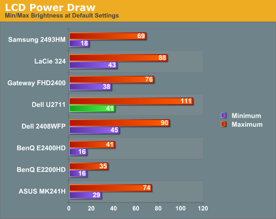
Going along with the brightness levels, here are the power requirements we measured at the Windows desktop using the minimum brightness (53nits) setting along with 100nits (13%), 200nits (36%), and maximum brightness (340nits).

This is another area where we think the U2711 could be improved, but the cost might be too high right now. CCFL backlighting has been the norm since LCDs first came out, and it works but it's not the most power efficient way of lighting up an LCD. LEDs are the new and improved method, but while they can save power they also tend to deliver a lower color gamut. RGB LEDs address that shortcoming but they cost more and appear to use a similar amount of power compared to CCFL (and we've only seen them used in laptops so far). The U2711 draws a minimum of 41W, but a more realistic setting of 200nits will pull 72W. At maximum brightness the display settles down to 111W, but we measured a peak draw of 124W. (When we first cranked up brightness from 36% to 100%, brightness also reached 390nits before declining to 340nits.) We'd like to see LCDs that deliver all the color quality at half the power draw, but right now it's more a question of priorities: if you go green on power, your green colors may end up lacking. And to keep things in perspective, 72W at 200nits for a 27" LCD is still about half the power of your typical 21/22" CRT running at ~200nits!


153 Comments
View All Comments
jmurbank - Saturday, January 23, 2010 - link
You explain DPI completely wrong. DPI is dots per inch or pixels per inch. It is the space between pixels on the screen that basically has no relationship how graphics is realistically being shown on the display. Lower then 0.28 mm DPI for the monitor is better for computers while higher is OK for TV.The DPI for your desire OS is different than the DPI for your monitor. Each DPI relates to something else, but the DPI you have to look out for is the value in the OS and not the display since you are dealing with formatting issues. The calculation of how fonts are sized includes operating system DPI, so you should not change the DPI at all if you are sharing your work to others. It is best to set to the standard what everybody is using which is 96 dpi for Windows. Then change the operating system font size.
If your eyes are not what they used to be, it is best to use lower resolutions instead changing the operating system DPI or referring to a monitor that has high DPI which can look like you are viewing through a sunscreen screen for your window. Of course lower resolution screens will lose your workspace, but you will not have to rely on high DPI. To gain the workspace back, use multiple displays. Of course lower the resolution and viewing it on a LCD monitor will look blocky, but you will have to live with a poor mans technology until there is something better.
CSMR - Saturday, January 23, 2010 - link
This is nonsense. Comparing non-native low resolutions to a change in dpi at the OS level, sizes of objects are the same, but with the OS change most things are sharp while with the non-native change everything is unsharp. Using non-native resolutions is just incorrect use of the monitor.jmurbank - Saturday, January 23, 2010 - link
It is not about what is sharp and what is not sharp. LCD are basically a poor mans technology and you have to give up quality if you can not see what is on the screen. LCD are designed for notebooks for their portability and not for their quality. If we go back to a better technology such as CRT, everything just works the way it is. Using a non-native resolution is not an incorrect use or a waste of the monitor's capabilities if you can not see anything what you are doing. Sure you can setup a panning which will make a virtual resolution be viewed at a native resolution, but with a sacrifice of panning.I do not recommend changing the operating system DPI just to make sure you can read at ultra high resolutions because it will create problems in the future.
strikeback03 - Monday, January 25, 2010 - link
The only CRTs worth using were the extremely high-end models. The vast majority of CRTs are absolute crap and just about any LCD is better.CSMR - Friday, January 22, 2010 - link
Text isn't smaller when the dpi setting is correct. Unless you want it to be smaller (you might now find smaller text more readable).Some apps do override the dpi setting, in my experience only browsers (and image software - fair enough). There you have to set a zoom level. That will zoom images and text (default on IE, firefox). Well I'm on Anandtech on FF now and it zooms correctly, as do all sites I have ever visited.
Now yes, images that were mapped pixel-to-pixel before are now not as sharp at a higher setting. That's mitigated by most popular software now storing icons at various dpi settings, but is a problem for web images and I usually return to 100% zoom for photographic images. However you get the same problem if you use a non-native resolution, except instead of just a few things being unsharp, everything is including text. So that is the worst possible option you can take.
If you like a 96dpi icon on a 96dpi screen (say), then you should like a 120dpi icon on a 120dpi screen even better. (Assuming the icon has been rendered at 120dpi, which most have.) So the icons comment doesn't make any sense.
You seem to be thinking about display of computer content at a very low level, each element separately. But everything has to have the right proportions and the key measurement is physical distance. Dpi settings allow you to have the right scale while preserving the right proportions.
JarredWalton - Friday, January 22, 2010 - link
When I changed the DPI on my system, all the icons look fine, but the spacing is all messed up. They look the same size as before, but there's now a bunch of empty space surrounding each icon. (This is looking at my desktop.) They look like they use 100x100 pixels instead of 75x75 (give or take).Really, my experience is that just about everything tends to be designed assuming users are running 96DPI... it's getting a bit better, but that's the short summary. There are a lot of screen elements that just run 1:1 mapping and ignore your DPI setting. Windows Vista seems to have done more than Windows XP at addressing this area, and Win7 may be even better than Vista, but no one has really nailed this IMO.
kmmatney - Saturday, January 23, 2010 - link
I don't have great eyes, so I was a fan of larger pixel sized monitors. That is until I upgraded to windows 7. One of the big problems with Windows 7 is that you can't turn off cleartype, or at least its extremely difficult to get rid of it. So, large pixel monitors look like crap. As an example, I was using a HannsG 28" LCD @ 1920 x 1200. This was fine with Windows XP, but absolutely horrible with Windows 7. I had to get rid of this LCD, and get one with smaller pitch, just to comfortably use Windows 7. My eyes are bad enough, I don't need cleartype making things even fuzzier...erple2 - Monday, January 25, 2010 - link
I'm assuming that:CPL\System\Performance Information and Tools\Adjust Visual Effects [sidebar], uncheck "Smooth edges of screen fonts".
Doesn't work? (This was from one of the first results of:
http://www.google.com/search?q=remove+cleartpye+fr...">http://www.google.com/search?q=remove+cleartpye+fr...
)
erple2 - Monday, January 25, 2010 - link
Awesome - Google figured out what I meant. The real URL ishttp://www.google.com/search?q=remove+cleartype+fr...">http://www.google.com/search?q=remove+cleartype+fr...
CSMR - Friday, January 22, 2010 - link
Not sure what's up with your system. XP was pretty awful at this, but on Vista/Win 7 it's a very strange problem to have.