Hitachi CML174 17'' LCD Plus Samsung 172T Revisted
by Kristopher Kubicki on February 12, 2003 3:24 AM EST- Posted in
- Displays
Benchmark
For comparison purposes, we ran a combination of CheckScreen, DisplayMate and VESA's Flat Panel Display Measurements Handbook (2.0) on the Hitachi CML174 against the previously reviewed Samsung 172T. Below is a table with the tests performed and notes we made during testing. Our test machine is composed of an Inno3D GeForce4 4200 using the VGA 15 Pin D-sub as well as the DVI connections. We ran all of the tests at 1280x1024 pixels with a refresh rate of 60Hz. Before the final benchmark, we calibrated the monitor as per the instructions included with DisplayMate; any changes to the LCD during the initial calibration run are noted in the observations. Response time benchmarks will be reported on the second page of our examination.
If you read our previous 172T review, you will see that we changed our traditional benchmark to represent a quantitive, rather than subjective, scaling system (5 is the best rating, while 0 is the worst). Recently, the folks at NEC and VESA were able to introduce us to some new benchmarking techniques which we will also be attempting. If you are familiar with the VESA FPDM2 you will know that this is a very thorough and complex document, but it does provide lots of excellent technical information on LCD displays.
| DisplayMate/CheckScreen/VESA FPDM 2.0 |
||
| Test |
Monitor |
Observations |
| Intensity range check |
172T (digital) |
5, Looks good |
| 172T (analog) |
5 |
|
| CML174 (digital) |
4.5, close but slightly too bright |
|
| CML174 (analog) |
4.5 |
|
| Black level adjustment |
172T (digital) |
4, Black levels still slightly high |
| 172T (analog) |
4 |
|
| CML174 (digital) |
3.5, blacks lighter than on the 172T |
|
| CML174 (analog) |
3.5 |
|
| Defocusing, blooming and halos check |
172T (digital) |
5, None |
| 172T (analog) |
5 |
|
| CML174 (digital) |
5, None |
|
| CML174 (analog) |
5 |
|
| Screen uniformity and color purity |
172T (digital) |
5, Uniform |
| 172T (analog) |
5 |
|
| CML174 (digital) |
4, large bright patch present in lower half of screen |
|
| CML174 (analog) |
4 |
|
| Dark screen (Glare Test) |
172T (digital) |
4, slight glare |
| 172T (analog) |
4 |
|
| CML174 (digital) |
4, slight glare |
|
| CML174 (analog) |
4 |
|
| Primary colors |
172T (digital) |
4, unscaled hues display fine, but not perfect. |
| 172T (analog) |
5 |
|
| CML174 (digital) |
3.5, problems with achieving all colors correctly |
|
| CML174 (analog) |
4.5 |
|
| Color Scales |
172T (digital) |
3, Still difficulty with reds, although an improvement over the 191T |
| 172T (analog) |
4 |
|
| CML174 (digital) |
2, severe color inaccuracies, even after recalibration |
|
| CML174 (analog) |
3 |
|
| 16 intensity levels |
172T (digital) |
4, Good, but not perfect |
| 172T (analog) |
4 |
|
| CML174 (digital) |
3.5, problems with red |
|
| CML174 (analog) |
4 |
|
| Pincushion/barrel distortion |
172T (digital) |
5, None |
| 172T (analog) |
5 |
|
| CML174 (digital) |
5, None |
|
| CML174 (analog) |
5 |
|
| Geometric Linearity |
172T (digital) |
5, no curvature |
| 172T (analog) |
5 |
|
| CML174 (digital) |
5, no curvature |
|
| CML174 (analog) |
5 |
|
| Focus check |
172T (digital) |
5, Uniform Focus |
| 172T (analog) |
5 |
|
| CML174 (digital) |
5, Uniform |
|
| CML174 (analog) |
5 |
|
| Horizontal color registration |
172T (digital) |
5, Level |
| 172T (analog) |
5 |
|
| CML174 (digital) |
5, Level |
|
| CML174 (analog) |
5 |
|
| Vertical color registration |
172T (digital) |
5, Level |
| 172T (analog) |
5 |
|
| CML174 (digital) |
5, none |
|
| CML174 (analog) |
5 |
|
| Fine line moiré pattern |
172T (digital) |
5, None |
| 172T (analog) |
5 |
|
| CML174 (digital) |
5, none |
|
| CML174 (analog) |
5 |
|
| Screen regulation |
172T (digital) |
5, no problems |
| 172T (analog) |
5 |
|
| CML174 (digital) |
5 |
|
| CML174 (analog) |
5 |
|
| Streaking and ghosting |
172T (digital) |
5, none |
| 172T (analog) |
3, streaking present, but expected |
|
| CML174 (digital) |
5, none |
|
| CML174 (analog) |
3, similar to 172T |
|
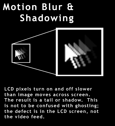
Before getting too far into our analysis of the benchmark, we would like to take some time to explain the three most misunderstood terms we use in our benchmarks. We will start with 'trailing' also know as 'shadowing' or 'motion blur.' This phenomenon is the reason why people demand low response time LCDs and only occurs on LCD's. The problem occurs when the individual LCD pixels takes several milliseconds to turn off after turning on. The result is a sort of “ghost” that follows the actual image.

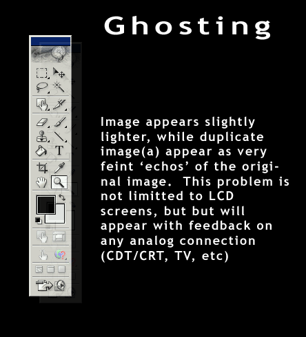
However, do not confuse this with ghosting! Ghosting, (official described by VESA as cross coupling), occurs when an image produces a sort of copy of itself over an existing image. This defect is the result of interference and is not limited to LCDs.

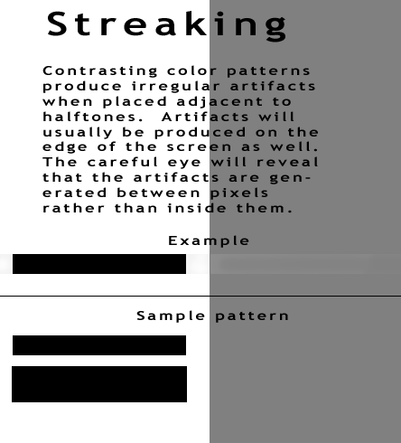
Streaking is the hardest defect to describe, but the image below should provide a quick and easy visual reference. Briefly stated, it is the creation of artifacts on contrasting color schemes. Again, this problem is not dependant on LCD screens, but occurs on TV's, CRTs, etc. In fact, it will occur on any connection that is dependant on an analog signal. When a signal travels along an analog connection, the cabling behaves much like an antenna, corrupting the VGA signal.

As we can see from our benchmark, streaking on the analog connection proved very problematic. Just by reading white text on a black background, we saw waves inside the text similar to fine Moiré. If you plan on buying this monitor, we highly encourage the use of a DVI connection. We have stressed with several other reviews that analog just does not cut it for LCD's, and it is really a shame that 15-pin analog connections persist even today. If you have not seen our other complaints about the Digital to Analog back to Digital process before, please refer to the Daewoo L700C review we did several months ago.
Overall, our first impressions on this half of the benchmark were not as competitive as we had expected. Our largest complaint was in screen uniformity. We noted in our review of the Daewoo L700C that there were distinctive light patches along the edges of the screen. These patches are caused by the backlights shining unequally across the rear of the panel. On the CML174, the bottom of the LCD produces a slightly brighter image than the other sides of the LCD. We mentioned earlier that the screen employs a combination of 4 CCFLs (cold cathode florescent lights) to produce backlight for the monitor. We would accredit the lack of uniformity to a non-traditional positioning of the backlights to produce an offset in uniformity.
Screen uniformity is very important. In the world of art, and display technology, the brightest bright and darkest dark are the two areas that the eye immediately focuses on. On the Hitachi CML174, the eye drifts from the center of the screen to the lower center portion of the monitor because this area produces a slightly lighter image than the rest of the screen. That being said, we should also point out that the Samsung 172T produces one of the most uniform screens we have seen to date, and really stomps all over the CML174 in this category.
The color rendition tests proved very mediocre as well. Our standards have increased after seeing products like the 172T, but we can easily identify problems when we have one LCD next to the other. Like the 191T from July, the CML174 has a real hard time with intense shades of green and red. While doing the benchmark, we continually readjusted the brightness and restarted to produce the correct tones instructed by DisplayMate. While several sources insist the brightness should be turned all the way down, we determined the sweet spot for (almost) accurate color replication lies in the 30 – 50% range. We can actually determine why by mathematically analyzing the specifications given to us; contrast ratio and brightness.


0 Comments
View All Comments