The All-in-One Battle: Dell's XPS One 24 vs. Apple's iMac
by Anand Lal Shimpi on October 30, 2008 3:00 PM EST- Posted in
- Systems
Insert: Obligatory Matrix Reference Here
Dell has been working quite a bit on improving the industrial design of its products, and while the biggest changes are coming on the mobile side, the new XPS One 24 does look good.
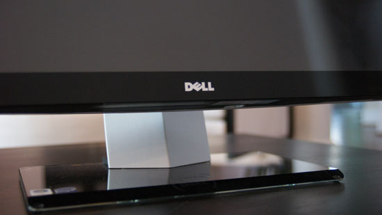
It sits low and wide thanks to the speakers on either side of the display, which are honestly the most awkward parts of the system. However given that Dell opts for function over form here you actually get speakers that aren't terrible, they are at least better than what's in Apple's iMac. You're still better off with an external set of speakers but that would defeat the purpose of the all-in-one now wouldn't it?
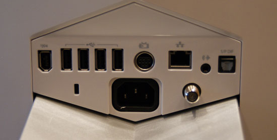
There are a flurry of ports at the back of the XPS One 24, you've got one FireWire, four USB, one video input, 10/100/1000 Ethernet, 1/8" audio out, optical audio out and coax in for cable TV.
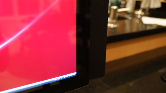
At rest this is what the lower right corner looks like...
By far the coolest feature of the XPS One are the touch controls on the right side of the machine. Bring you hand close to the right edge of the display and the touch controls light up, you can control volume, control music playback or eject a disc. The touch controls do offer some feedback, they will vibrate a little once your input is recognized.
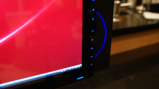
Bring your hand closer and you've got controls
The volume/playback buttons are nice, but they don't work properly with iTunes. If iTunes is in the foreground then you're ok, have it in the background and you're screwed - the playback control buttons do nothing. Obviously this isn't the case with Windows Media Player 11, but limiting the usefulness of these controls to a single application is silly. Part of this limitation may be the unfortunate reality that Dell doesn't control the entire software stack being run on the XPS One, it may simply be a limitation of iTunes under Vista, but regardless of the cause it's an annoyance.
Dell has implemented a nice, very Apple-like brightness and volume OSD whenever you adjust either of these things. But once again there are limitations. I installed Pidgin to, you know, talk to people on this thing - but unfortunately with Pidgin in the foreground Dell's volume control and brightess OSD doesn't appear anymore. Again this seems like a software/OS limitation, but it's one area where the XPS One falls short of something like the iMac.
I'll get to the discussion of what Dell has done to close the Apple gap on the software side of things in a moment, but for now let's keep ogling the exterior.
Dell's claim to fame with the XPS One is that you only need a single cable, for power, the rest of the machine is totally wireless. While there's an Ethernet jack on the back, but you've got a built in Broadcom 802.11n wireless adapter for Internet access and the machine ships with a wireless keyboard and mouse as well as Bluetooth for any additional peripherals.
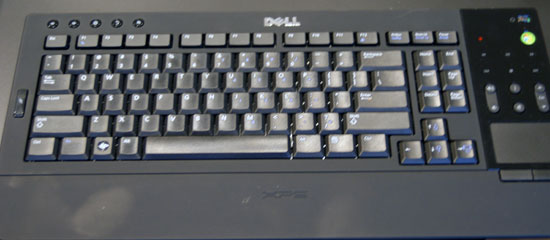
The One's keyboard is quite stylish but it falls short in a few key areas (wow, terrible pun). In order to satisfy the design requirements there's no dedicated numeric keypad, instead you've got to rely on the top row of numbers or use a function key combination.
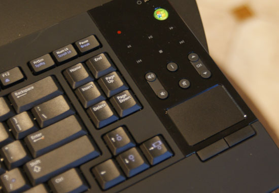
Like a laptop keyboard, the XPS One's keyboard has a function key that you can use to put the computer to sleep, eject a disk, or increase/decrease brightness. Since the XPS One's mouse is pretty much terrible, I found myself using the keyboard's built in trackpad quite a bit. Now here's where I was surprised - I actually didn't mind, in fact, I wanted a larger trackpad. I'm so used to trackpads from using notebooks all the time that for an all-in-one machine like this a builtin trackpad just made sense, but honestly it needs to be larger. I get the reasoning for a compact keyboard, but it seems like there's just a lot of wasted space on the design, especially near the trackpad. Have a look at Apple's latest MacBook/MacBook Pro, I want a trackpad of that size, maybe a bit smaller and you can do away with the mouse altogether if you'd like (except for gaming of course). The trackpad unfortunately has no way of scrolling, which is a sad limitation. I'd like a two finger scroll gesture here please, thanks.
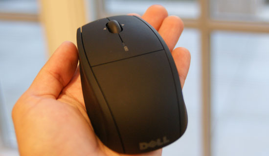
I spoiled much of the surprise already, but I was not a fan of Dell's bundled mouse. While tracking is mostly ok the mouse doesn't appear to be very precise, resulting in jerky behavior when trying to make small movements on the screen. Instead of smoothly moving from one point to another it tends to stairstep. Now the mouse itself isn't reason to avoid the XPS One 24, I would simply encourage Dell to bundle something a little more respectable.
The other issue is that both the keyboard and mouse rely on two AA batteries, two for the keyboard and two for the mouse. It would be nice to have both of these devices be USB rechargeable or perhaps have some sort of integrated charge dock in the base of the XPS. Again, not a deal breaker but room for improvement should Dell decide to perfect the approach to including wireless peripherals.
Admittedly the one-wire setup is a bit liberating, it's very notebook-like in its ability to be put anywhere without disturbing the natural flow of things. For this very purpose I conducted today's review with the XPS One 24 in my kitchen.
A very important consideration for a machine that could end up someplace you normally wouldn't find a computer is noise, or more appropriately, lack thereof. The XPS One uses a Seagate Barracuda 7200.11 3.5" SATA drive which is great from a performance standpoint, but it's deceptively noisy in the XPS One. You can hear disk accesses very clearly, which is distracting since the whole system is incredibly quiet. I hate to keep advocating for the use of SSDs given how expensive they are, but in a system like this it makes total sense. Every other aspect of the XPS One is absolutely silent, but the drive is distracting. It almost sounds like the interference noise you get when you've got a cellphone too close to computer speakers. For an otherwise silent machine, this stands out.


60 Comments
View All Comments
UpsetAtDell - Saturday, December 19, 2009 - link
Beware ordering a Dell system! I ordered one for my mom for Christmas on Nov 20th with a delivery date of Dec 9th. On the 17th of Dec I was notified that it wouldn't be delivered until Dec 31st, too late for me to set it up for her. After a very difficult time getting through to a customer service representative, I was told that they would not rush the order or rush shipping for me. I had to cancel and buy from a retail store instead. Beware Dell!strikeback03 - Monday, November 3, 2008 - link
Would it kill either of these to have USB ports somewhere more accessible than the back of the device? I plug stuff into my front ports daily. Maybe on a side or behind a door or something? The single-cable look goes away if you have a USB extension hanging out full-time to get a port in a more useful location.Maybe someone here can answer this - how do you make OSX play all the photos in a folder on a USB drive as a slideshow? I brought some photos from an event at work into the main office, and we decided to show them on the head administrator's 24" iMac as it was the largest display around. We could get a slideshow to launch but not play, we ended up launching XP in Parallels to see the photos. Later that night I IMed a friend who uses a Mac, and she didn't know either. Can this really be that hard?
ffakr - Monday, November 10, 2008 - link
Apple's keyboard has an un-powered USB port on each side. It'll run most things.. but it doesn't have the current to run a bus powered 2.5" drive or the like.However, I agree.. the iMac needs to have a more convenient way to access USB. I use a MacBook Pro docked to a Dell 24" and I'm very happy to have 2 USB ports on the right side (and a flash reader!!, come on Apple).
OS X doesn't integrate a slideshow viewer into the Finder like Windows does in Explorer. Apple wants you to import them into iPhoto.
There are several easy ways to view pictures though.. This is generally fine for the owners of a machine but I understand that you just wanted to look at the pics on someone else's computer.
- There is a finder view called CoverFlow. You might be familiar with this in iTunes for Windows. It's also a Finder view and you can scroll the previews as large as you want and flip through the pics like you were shuffling photos on a desktop. You can switch between finder views from the top border of a Finder window.
- Select all the files and open them. Unless you've set .jpgs to open with another app, they should all open in Preview.app which will show you one picture per page (It's the same interface used to render PDFs in OS X).
- Pretty similar.. you can drag the volume (flash drive) or folder full of images onto an app like Preview and it'll open them up. It actually does something cool.. it'll open up photos in sub-folders together in the same window. This is a good reason to have common apps in your Dock.
It's a Mac.. there's probably a half dozen other ways to do this that I can't think of or that I'm not aware of.
As for the Dock argument. There are some cool things you can do with the Dock that you can't do with a task bar, at least I don't think you can do them in Windows. I'm still a 95/98/2000/xp guy.. i've mostly avoided Vista.
- I can drop a folder onto a task bar and access the content by clicking on it. The contents open up in a transparent window. I can drill down into sub directories by holding down the mouse or I can open the directory in a finder window.
- The dock is organized. Permanent shortcuts on the top/left, running apps that aren't always on the dock to the right/bottom of your permanent icons, then a divider bar where folders, doc shortcuts and collapsed App windows go.
- App icons can be stateful. They can give you feedback on your unread mail count (mentioned earlier)...they can have progress bars.. they can even show content including video/animation.
- I don't recall seeing this in any Windows app.. you can right click (command-left click) on a Dock icon and perform App defined things. e.g. I can right click on Mail and select Compose an Email.
rudy - Sunday, November 2, 2008 - link
In this.4wardtristan - Saturday, November 1, 2008 - link
yes a SSD would be a huge improvement over a traditional HDD, but are you (or any one else) ready to fork up the cash to pay for 750GB of SSD space??? (with todays prices)nubie - Sunday, November 2, 2008 - link
I have been running my PCs off of scavenged Tivo HDDs for about 2 years, it doesn't need to be SSD to be unobtrusive.The HDD just needs to not sound like a rock crusher and/or jet engine, not really difficult. But it does require attention and maybe a couple $$.
Ofish - Saturday, November 1, 2008 - link
"...I settled on the latter and simply drug the desktop icon to the Internet menu in the Dock."I couldn't pick up my couch, so instead I simply drug it across the room. lol
I think you mean dragged
nubie - Saturday, November 1, 2008 - link
http://www.merriam-webster.com/dictionary/drug%5B3...">http://www.merriam-webster.com/dictionary/drug%5B3...I don't know, Merriam-Webster has a listing for it, maybe it is best not to complain before checking a dictionary.
I thought this was an interesting review, but I still don't see why they can't put a real PCI-E card in these systems, the Dell is huge (and heavy) with plenty of room for a full-size video card.
Dell needs to pick a quiet hard drive too, this is an area where manufacturers really need to run quality control.
TA152H - Friday, October 31, 2008 - link
Citing the PS/2 Model 25 as an example of an "all in one" computer is about 10 years late to the party. There were many before that, including the TRS-80 Model II, Model III, and Model 4. The Lisa was essentially like that too, unless you count the keyboard, and so was the original Mac.I have all these vintage machines at home, and the PS/2 Model 25 is kind of crappy. PS/2's as a rule were far better made than the rubbish that is sold today, but the Model 25 is the bottom feeder of the line, and is rather inelegant. If you really want a laugh, get your hands on a Model 4P. This monster was supposed to be portable, but it's a real beast. I don't have one though :( .
xyster - Friday, October 31, 2008 - link
Windows vs OSX debate aside, the XPS 24 seems to me like it was designed to be a media center PC, not a gaming machine. The premium speakers, the media center controls on the machine, the trackpad on the keyboard, the choice of a quad-core processor and the choice to use a low-heat producing graphics solution-- its pretty obvious.The iMac on the otherhand, being one of the few desktop choices from Apple, was designed to be more open-ended, for gamers and general use included.
I think the Dell excels at what it was created for, and in that regard it beats out the iMac. With all the other alternatives in the PC market, if someone was looking for a gaming machine, I wouldnt suggest the Dell, but something else, which would excel as a gaming machine. Unlike the Mac market, the PC market has plenty of alternatives.
As a general computing device though, the iMac is a nice computer. I just dont think comparing these two computers to see which is 'best' is correct. Using the Apple as a reference system makes sense, but treat the Dell in the regards for which it was designed for.
Good article overall though. Thanks for posting it.