The LG G3 Review
by Joshua Ho & Anand Lal Shimpi on July 4, 2014 5:00 AM EST- Posted in
- Smartphones
- LG
- Mobile
- Laptops
- G3
Software
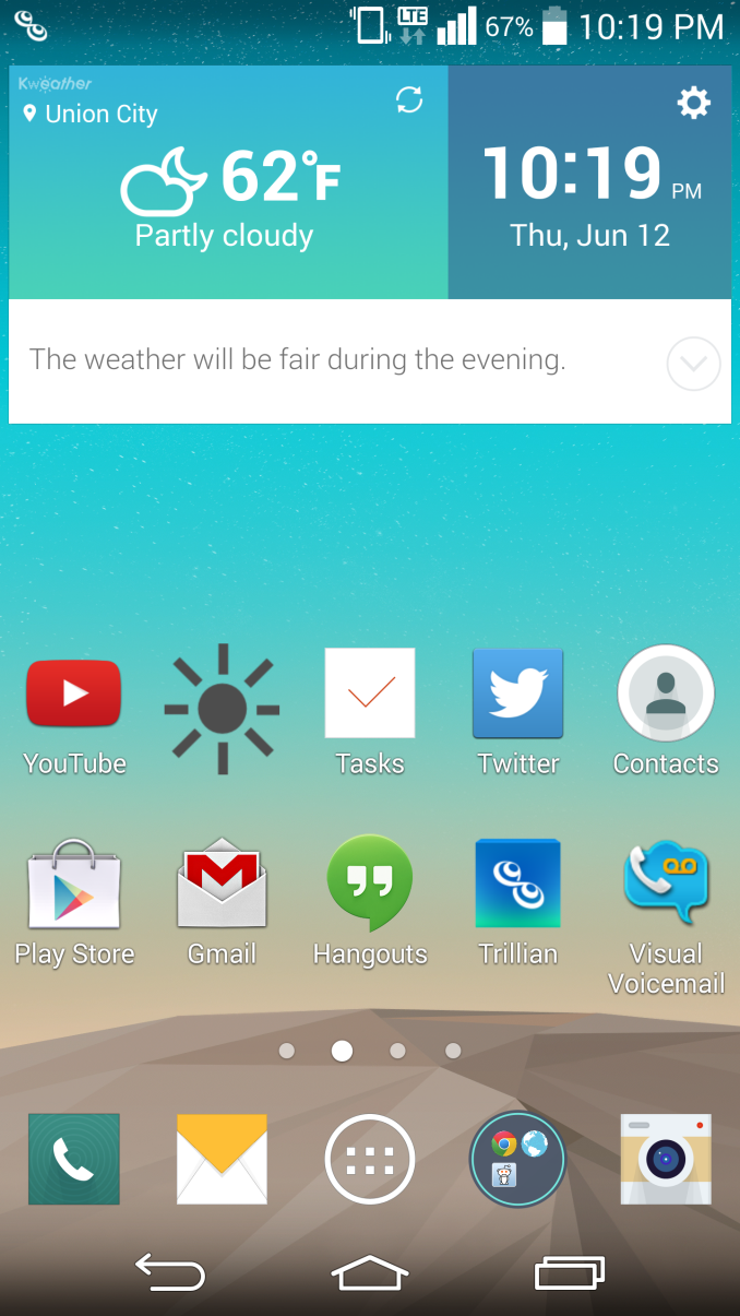
Lately, there’s been a significant trend towards flatter, simpler UIs. While HTC jumped on the trend early with Sense 5 launching on the One (M7), the Korean OEMs have been noticeably slower to move towards this simplification. In this case, Samsung refreshed TouchWiz for the Galaxy S5, and LG has done the same for the G3. While I had very little trouble getting around LG’s UI before this refresh, it definitely struggled in the aesthetic department. LG previously had a strongly skeuomorphic UI, which meant that the UI elements were designed to resemble physical objects. While this may have helped back when computers were a novel invention, it doesn’t make quite as much sense now. Thankfully, LG has gotten far away from this. Overall, there’s very little unnecessary depth to the user interface, and the result is definitely aesthetically pleasing, although opinions may vary. I definitely feel like this interface is very close in aesthetic design to the Galaxy S5’s TouchWiz UI, although the functionality is different. The only real criticism I have here is that the odd shadow effect on icons should go away, although it doesn’t truly affect the overall design.
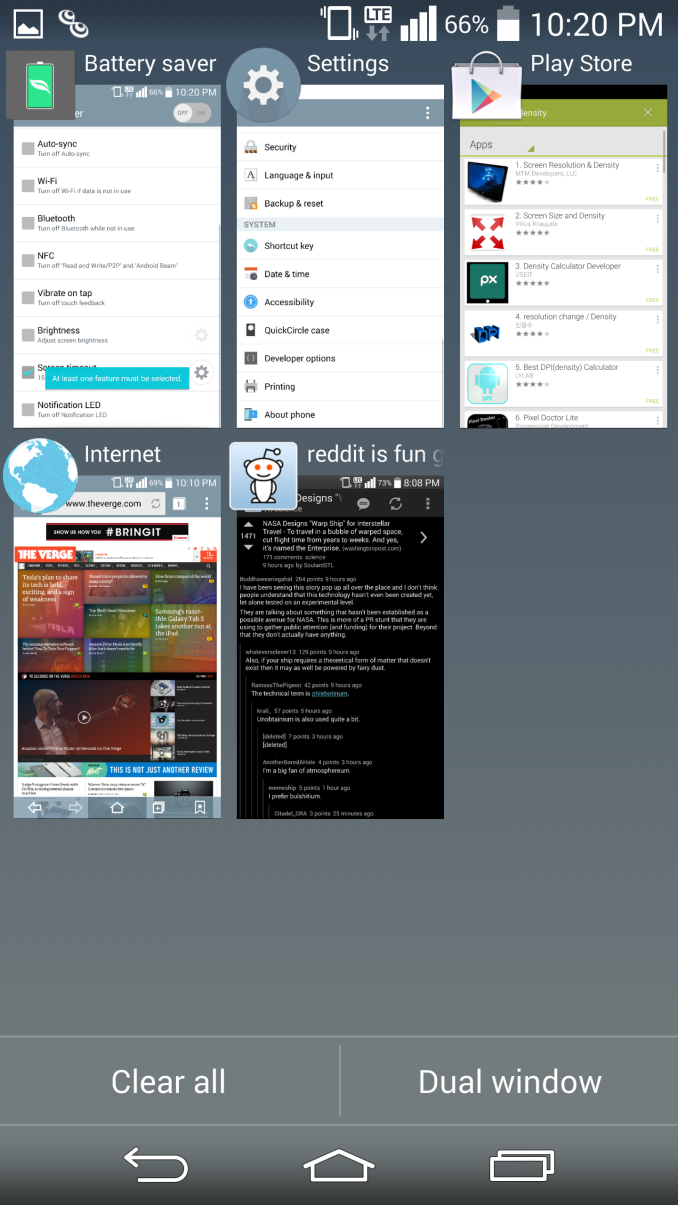
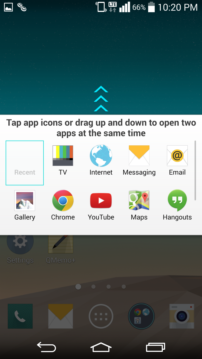
While opinions on how a UI works (or doesn’t) are mostly subjective, in my experience there have been far fewer friction points in the G3 UI when compared to TouchWiz in general. The best example of this is the multiwindow mode in the G3. While Samsung has done a great job of getting widespread developer adoption for their interface, LG has clearly put more thought into the user experience here. Instead of requiring the user to mentally keep track of whether to use Android’s task switcher or the multiwindow option, the multiwindow toggle is in the task switching menu, which means it’s far more likely that it will be used as needed. The multiwindow functionality also allows for switching immediately to the last two windows used to save time. The only issue I have here is that manipulating open windows isn’t as easy as it should be. This is because closing one of the windows is done by tapping the tab separating the two rather than simply swiping up or down. It does make sense once you learn how it works, but may confuse some at first.
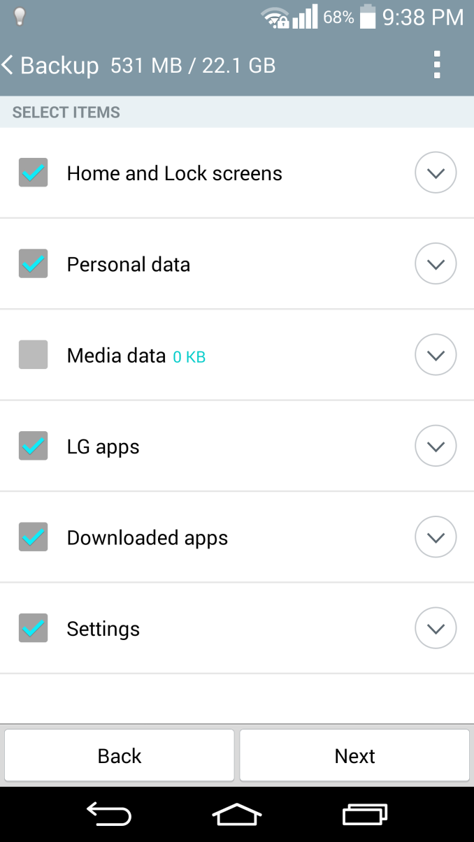
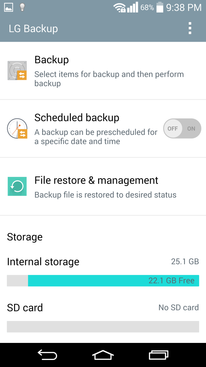
LG isn’t perfect at this though, there are some issues such as the email client. Specifically, email providers like Hotmail/Microsoft don’t work properly if set up as a POP/IMAP account, and rely on the user to know that they have to set up Hotmail as an Exchange account. For the most part though, these issues are rare. LG seems to have done a good job with their applications, with cohesive design throughout that utilizes Google design guidelines. Things like the smart cleaning application in settings, and the LG backup application are all ways that LG has actually improved the user experience. There really aren’t a lot of friction points in the usability of stock applications, other than the ones clearly designed for SKT or are otherwise Korea-only.
Of course, LG’s “gimmicks” also tend to be more useful as well. While I struggled with some unreliability on KnockCode for the G Pro 2, the G3’s version is great in practice. KnockOn and KnockOff both work as expected too. These features are all easy to grasp as well, with very little learning curve. The same isn’t necessarily true for features that ship with the Samsung Galaxy S5, such as the fingerprint sensor. It's not all perfect though, as Smart Notice doesn’t seem to be useful most of the time. Fortunately, it won’t get in your way and it’s integrated well into the clock/weather widget. While both LG UI and TouchWiz have a largely similar experience, I think that LG ends up with a less frustrating one. There are some issues with clutter in the notification bar though, as out of the box there’s almost no room for actual notifications. Althought annoying, it's easily solved by toggling away most of the unnecessary settings.
Overall, I’m happy with LG’s UI. The annoyances are few and far between, and LG has adopted a solid aesthetic design for this generation. While I didn’t notice a significant delta in overall performance compared to the One (M8), I did notice that the G3 had more issues with stutter in animations overall. I suspect that this has relatively little with the UI design itself, as most animations are simple panning movements without 3D effects.




174 Comments
View All Comments
piroroadkill - Friday, July 4, 2014 - link
Basically, the screen is stupid, costs more, wastes battery, slows down performance, heats it up so it throttles more, and isn't actually noticeably different compared to 1920×1080 at viewing distance.Yeah, so predictable. LG is doing the worst kind of spec-sheet oneupmanship.
Homeles - Friday, July 4, 2014 - link
I picked up a G2 last year, and was a bit frustrated that the G3 came out so quickly. Looks like I'm not missing out.piroroadkill - Friday, July 4, 2014 - link
Yeah, the G2 is a fine device, and I'd choose the better battery life.mahalie - Friday, July 4, 2014 - link
The G3 has significantly better battery life than the G2. You can complain that the screen is unnecessary all you want, but the phone performs wells and has great battery life, so what's the issue?fokka - Friday, July 4, 2014 - link
the g3 beat the g2 in one test here, what numbers are you referring to?the issue, as i see it, is that the 1440p display adds cost, decreases performance, battery life and screen brightness, not to mention overall screen quality, compared to using a good 1080p display, all while adding very little in regards to usability and visual advantages.
many people, me included, think that LG should have gone with a "good ol'" 1080p display in this generation and improved upon the great battery life that the g2 offered, instead of using a 1440p screen with borderline useful benefits mainly for bragging rights.
of course not everybody agrees with this stance, but it seems to be the one main complaint about this otherwise mighty fine piece of technology.
and you are right, the g3 (still) performs well and (still) has great battery life, but with a more reasonable 1080p display those points could have improved even more. that's all i (!) am saying.
retrospooty - Friday, July 4, 2014 - link
You may be right about the screen. Looks like some trade-offs were made, but it's still a good phone that stacks up well against it's competitors. It's still a good 5.5 inch phone that is basically the same size as an S5 or One M8. That and I cant remember the last time I had any phone on 100% brightness. I have a G2 now and keep it as 66%. In rare cases I move it up to 70%. 75% is simply too bright to look at.flatrock - Tuesday, July 8, 2014 - link
I just checked the brightness on my G2. It's at 41% and is plenty bright for indoor viewing at that level. I might put it up to 75% while using it outdoors such as at my son's soccer game. Unless the sun is shining directly on the screen, 100% is overkill. In a dark rooms I set the brightness somewhere in the teens.ColinByers - Monday, September 29, 2014 - link
Well, LG G3 is definitely one of the better phones on the market, all though there are a few like HTC One M8 and Motorola Moto G that can compete with it (see http://www.consumertop.com/best-phone-guide/ for example).upatnite2 - Friday, July 4, 2014 - link
Same thoughts! I can deal with the battery life, but brightness and contrast are major issues. We're seeing at least a few reviews that mention "dim", which isn't a good sign, and I'm starting to wonder about performance after it heats.If they put in the same display as last year, LG would sell tons more, and myself included.
Now, I have to wait to see if the S805 vsn comes to the states and if it's any better, wait for the N6, or get a used G2..
HotInEER - Monday, July 7, 2014 - link
I agree. 3 things are keeping me from trading in my HTC One M8 for this. The brightness, contrast, and lack of built in wireless charging. I don't want a flip case for that feature. Can't stand them, and sure in the heck are not paying $60 for a stupid case for that. I'd consider buying a additional back for wireless charging, however I've read on numerous sites that the US models do not have the pins.