The All-in-One Battle: Dell's XPS One 24 vs. Apple's iMac
by Anand Lal Shimpi on October 30, 2008 3:00 PM EST- Posted in
- Systems
The PC industry loves to repeat history. Today's cloud computing trends are nothing more than a rehash of the mainframe architecture of the 1960s 70s right? The use of GPUs as compute accelerators pays homage to a time when general purpose microprocessors were accompanied by additional, off-chip hardware depending on the applications you wanted to run. The issue with both of these statements is that unlike simply repeating history, the PC industry tends to like to improve upon good ideas in history.
At many points during the evolution of the PC we've had what's called the all-in-one, basically a PC with an integrated monitor. Now don't get the all-in-one confused with a notebook, because unlike a notebook the all-in-one is desktop sized and with no battery, it's not intended to be portable.
The point of the all-in-one is to save space, to integrate the monitor into the computer chassis to make it either look better, take up less space, or some combination of the two. Every desktop PC needs a monitor right? So why not integrate the monitor into the PC and sell it as a nice bundle that you simply have to plug in; no messy cables, the OEM gets additional revenue from selling both a display and a PC, and somewhere along the line this benefits the end user.
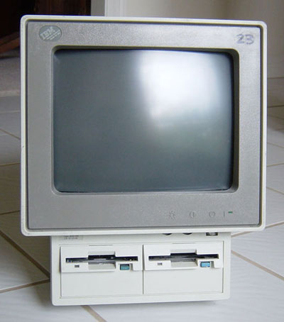
With each generation of the PC's evolution we went through an all-in-one phase. In the late 80s we had things like the IBM PS/2 that was available in an all-in-one configuration:

The IBM PS/2 Model 25 - courtesy Wikipedia
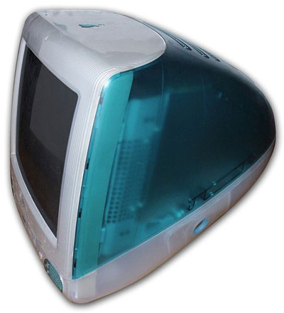
Apple got hooked on the all-in-one designs and just never seemed to give them up, even when they were dying on the PC side. Remember the awful looking first generation iMac?

The iMac G3 - courtesy Wikipedia
It was different as it was a splash of color in a sea of beige boxes, but Apple couldn't hide the basic limitations of all-in-one PC designs. They are terribly limited from an upgrade standpoint and the biggest issue is that you're stuck with whatever mediocre monitor is integrated into the chassis.
This all started to somewhat change with the later iMacs, mainly thanks to the adoption of decent LCD displays. While the older iMacs and other all-in-ones used CRTs, the move to LCD technology made these things far more attractive. Remembering back to the early days of PC LCDs, there's no way you wanted to be stuck with one of those for any period of time. With LED backlights and far improved black levels, viewing angles and response times, today's LCDs are decent enough where staying married to one for a handful of years isn't too scary a thought.
The other parts of the computer have also gotten smaller, cooler and faster. With the performance delta between desktop and notebook performance shrunk down to simply GPU and I/O differences, it's now possible to build an all-in-one that's just as fast as a modern day desktop. Combine that with a good quality LCD panel and you've got a recipe for an all-in-one that I might actually want to own.
Granted the limitations still exist, these things aren't super upgradeable; while you can add more memory or replace the hard drive, upgrading your video card is usually out of the question as the GPU and its memory are generally soldered onto the motherboard. You can forget about dual-display options, not to mention that if anything ever happens to the display you've got to send the entire machine in for repair. There are many reasons not to consider an all-in-one, but these days having more than one PC in your home isn't unheard of, and PCs are finally stylish and compact enough for them to make an appearance in more unusual locations, places where aesthetics do matter and this is where the modern all-in-one has a purpose.
Dell recently contributed to the all-in-one PC market with its XPS One introduced at the end of 2007. As Dell's attempt to capture some of the iMac market the original XPS One featured a built in 20" widescreen LCD and boasted only needing a single cord for full operation - power. The keyboard, mouse and internet connectivity were all wireless, making it perfect for a very modern setup.
Since the XPS One's release, Apple has updated its iMac line to make it more competitive in terms of pricing and hardware, the top of the line iMac now ships with a 3.06GHz Core 2 Duo processor while last year it shipped with a 2.4GHz part. The XPS One was also at a disadvantage as Dell only offered one panel size at 20" while Apple offered a 20" and a 24". One obvious downside to the all-in-one is that you're stuck with the monitor you bought with the machine, so if you outgrow your 20" you're out of luck. The 24" panel size however seems to be the sweetspot these days, it gives you enough desktop resolution for pretty much everything including full 1080p video playback which is becoming more and more important.
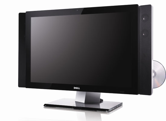
Naturally you know where all of this is headed - Dell is updating the XPS One. It's still called the XPS One but now it's got a 24" panel with a 1920 x 1200 display, some faster hardware and a new (PRODUCT) RED version.

Yeah, it's pretty stylish
I'll dive into specs in a moment but first I figured I'd introduce you two.

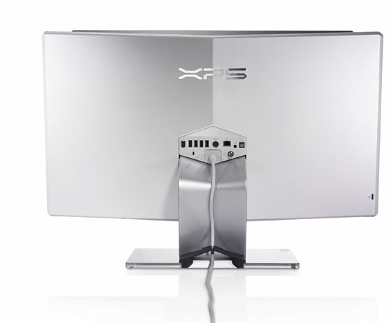
Oooh, a plethora of ports
The New XPS One 24
Dell had such clean naming with the XPS One, but tack the number 24 onto the end of it and all of the sudden we're back in silly land again. The 24 obviously denotes the size of the LCD panel used in the XPS One, but don't be fooled, this isn't the same 24" panel that's used in the 2408WFP.
There are four basic configurations that Dell is offering of the XPS One 24, all shipping today:
| Dell XPS One 24 - $1699 | Dell XPS One 24 (PRODUCT) RED- $1699 | Dell XPS One 24 - $1999 | Dell XPS One 24 (PRODUCT) RED- $2299 | |
| CPU | Intel Core 2 Quad Q8200 | Intel Core 2 Quad Q8200 | Intel Core 2 Quad Q8200 | Intel Core 2 Quad Q8200 |
| GPU | Intel GMA X4500 (G45) | Intel GMA X4500 (G45) | NVIDIA GeForce 9600M GT 512MB DDR3 | NVIDIA GeForce 9600M GT 512MB DDR3 |
| Display | 24" 1920 x 1200 | 24" 1920 x 1200 | 24" 1920 x 1200 | 24" 1920 x 1200 |
| HDD | 320GB 7200RPM 3.5" | 320GB 7200RPM 3.5" | 750GB 7200RPM 3.5" | 750GB 7200RPM 3.5" |
| Optical Drive | Slot load DVD+/-RW with double layer write capability | Slot load DVD+/-RW with double layer write capability | Slot load DVD+/-RW with double layer write capability | Slot load Blu-ray Disc burner (Writes to DVD/CD/BD) |
| OS | Windows Vista Home Premium SP1 | Windows Vista Home Premium SP1 | Windows Vista Home Premium SP1 | Windows Vista Ultimate SP1 |
| Price | $1699 | $1699 | $1999 | $2299 |
All four configurations come with an Intel Core 2 Quad Q8200, which is a 45nm Penryn based quad-core processor running at 2.33GHz with a 4MB L2 cache (2MB L2 per core). The smaller amount of cache should put the performance of the Q8200 at below that of a Q6600, but with four cores things like video encoding should go swiftly.
The base configurations ship with Intel integrated graphics (G45), while the upgraded configurations ($1999 and $2299) have a NVIDIA GeForce 9600M GPU, which ships with 32 SPs and a 128-bit memory bus connected to 512MB of DDR3 memory.
The systems either ship with a 320GB or 750GB 7200RPM drive and either a slot loading DL-DVD+/-RW or a Blu-ray read/write drive. All configurations ship with an integrated analog/ATSC tuner. And in a move that Apple could stand to learn from, every last XPS One 24 ships with 4GB of DDR2 memory standard (although with only Vista 32-bit installed on the machine some of that memory does go to waste).
Dell sent me the most expensive configuration, priced at $2299 with all the trimmings, meaning it's got the NVIDIA GPU and the Blu-ray drive. Spec-wise the XPS One 24 is actually pretty decent, it has the potential to be a very quick machine.
If you buy one of the (PRODUCT) RED versions Dell will donate $50 to the (PRODUCT) RED fund against AIDS, buy one of those products with Windows Vista Ultimate and Microsoft will chip in another $30. Given that the RED versions aren't any more expensive than their counterparts the gesture is very nice on Dell's behalf.
And in case you're wondering, the RED versions aren't actually red, they have a metallic white back instead of the standard black.


60 Comments
View All Comments
Eidorian - Thursday, October 30, 2008 - link
It's not that hard.8800M GTS > 9600M GT
HanSolo71 - Thursday, October 30, 2008 - link
thanks for the top gear reference i wish more people in america would actually get thatsxr7171 - Tuesday, November 4, 2008 - link
Well we have BBC America. But people don't watch it much.Jovec - Thursday, October 30, 2008 - link
Well, that is the behavior of the MS Intellitype software - it will only control iTunes if it is in the foreground. By contrast, Logitech's Setpoint will control iTunes in the background. I have no idea if Logitech does something extra to make this work, or if MS is purposely limiting their keyboards. Had this exact same issue that encouraged me to move back to a Logitech KB.mfed3 - Thursday, October 30, 2008 - link
this has to do with the keypresses binding to windows commands. they will all work in media player, media center, and all windows programs.it has to do with itunes controls not mapping directly to the same commands.
logitech's software must look at the media process running and send the correct command
epyon96 - Thursday, October 30, 2008 - link
Not sure why the author insists on having a Mac OSX bias. I see nothing wrong with the Start menu nor do I find it outdated. Usually, it's 3 clicks max to get to a program with minimal mouse movement. I am not saying Mac OSX has a bad interface but I see nothing wrong with the Start menu unless you are a devoted OSX fan.I am slightly annoyed why Apple still insists on a single button mouse. For some strange reason, Jobs still insists that computer users are too stupid to learn to effectively use a two button mouse. So what does he give us? A one button mouse that tries to emulate two-button mouse behaviour. Sure it looks cool and has that novelty effect but it wears off after the showroom. It begs the question why?
What does the article mean when it says that the 24" inch flat panel monitors have trouble with 24 FPS 1080 Non-interlaced Blu ray playback? Is it trying to say that 24 FPS refresh rate is not possible on the flat panel without ghosting?
CMcK - Friday, October 31, 2008 - link
Apple haven't shipped a single button mouse with desktops or laptops for a few years now. The Mighty Mouse has four buttons - left, right, side (squeeze) and centre (press the trackball). Very useful. I have mine set for left click, right click, Expose and show desktop.Even the single, or indeed no button, Apple laptops have a left and right click. Just place a second finger on the trackpad and press the button or pad and you have a right click.
I don't find that I actually need to right click often while using OS X.
mikeepu - Friday, October 31, 2008 - link
Frankly I don't really sense a bias in the article. If anything the author is critical of both systems and just states his (keyword alert) 'personal' preference at the end of the article.But I do agree with you that there is nothing wrong with the Start Menu, its just that the Apple Dock is simpler in that only one click is required to start a program located on the dock or just two clicks if you have the Applications folder (the equivalent of the Programs folder in the Windows Start menu) attached to the Dock. But then again, where’s the harm in a few extra clicks to get to a program?
But man Do i want that Dell all-in-one for a Desktop media center :)
MrDiSante - Thursday, October 30, 2008 - link
I am also surprised at the obvious pro-Mac OS X bias in the article. Usually Anand is far more impartial, but this is more than a bit on the Engadget side. Pretty as Mac OS X is, I find that Vista actually offers the more practical solutions to task management problems.The taskbar is far better at showing the user what is and isn't running than the dock (something that Microsoft is mistakenly changing with Windows 7 and will hopefully reconsider). As the fact that there is text with the icons allows me to efficiently differentiate between the numerous windows I have open (again, something Microsoft should not change; OS X looks prettier, but Vista takes the usability prize here).
The start menu still makes more sense than Apple's solution since there is in fact a central place to go for all of your programs (although I personally think Linux does a better job of that).
Alt+tab scales far better than expose does. They both work fine if you're running 5 or fewer programs, but expose just gets messy really fast if you exceed that. If you have 10 or more programs open, with stickies gadgets/widgets etc, then Expose gets downright unusable.
Finally, Windows tends to be far more shortcut friendly. Start + number, and start + 3-4 characters + enter usually launch just about any application I need. Alt+tab switches to just about any program I need. Expose and the dock both struggle with shortcut-friendliness.
DCstewieG - Sunday, November 2, 2008 - link
Actually Apple was first on the shortcuts you're talking about. Pressing Apple+Space brings up Spotlight which lets you type the first few characters of the app to find it and Enter to run it.As for Anand's Mac bias, it's a very interesting story. Here you have a devoted editor of a PC hardware site who decided to give a Mac a spin for a month to write an article about it. What happens? He becomes a huge fan in the process.
You see a lot of comments saying that people use Macs because Steve Jobs put them in a trance or because they look nice or something, but here's a guy who came in fresh and decided he liked it a lot by actually using it.
If you haven't read it: http://www.anandtech.com/mac/showdoc.aspx?i=2232">http://www.anandtech.com/mac/showdoc.aspx?i=2232 (though it is a bit outdated now)